
FFT for Stock Prediction: Decomposing Market Cycles
An undeniable fact: economic activity is cyclical. Yet, this reality has long been overlooked by the quantitative community. Whether in asset pricing theory or trend trading frameworks, there is scarcely a place for cycle research—in the latter context, practitioners prefer terms like "oscillation" rather than explicitly acknowledging "cycles."
In this article, we explore cycles in the stock market. We will employ the Fast Fourier Transform (FFT) to decompose time-series signals into the frequency domain, identify main force capital through signal energy, and make predictions based on their operational cycles. Finally, we present three hypotheses, one of which has been proven.
FFT - Time-Frequency Transformation
(Data acquisition omitted).
We have obtained the Shanghai Composite Index (SSE) data for the past year. Clearly, it is a time-series signal. The Fourier Transform is precisely designed to convert time-series signals into frequency-domain signals. In other words, the Fourier Transform can decompose the SSE index into a combination of several sine waves.
# Apply Fourier Transform
fft_result = np.fft.fft(close)
freqs = np.fft.fftfreq(len(close))
# Inverse Fourier Transform
filtered = fft_result.copy()
filtered[20:] = 0
inverse_fft = np.fft.ifft(filtered)
# Plot original signal and reconstructed signal
plt.figure(figsize=(14, 7))
plt.plot(close, label='Original Close')
plt.plot(np.real(inverse_fft), label='Reconstructed from Sine Waves')
plt.legend()The output we obtain is as follows:
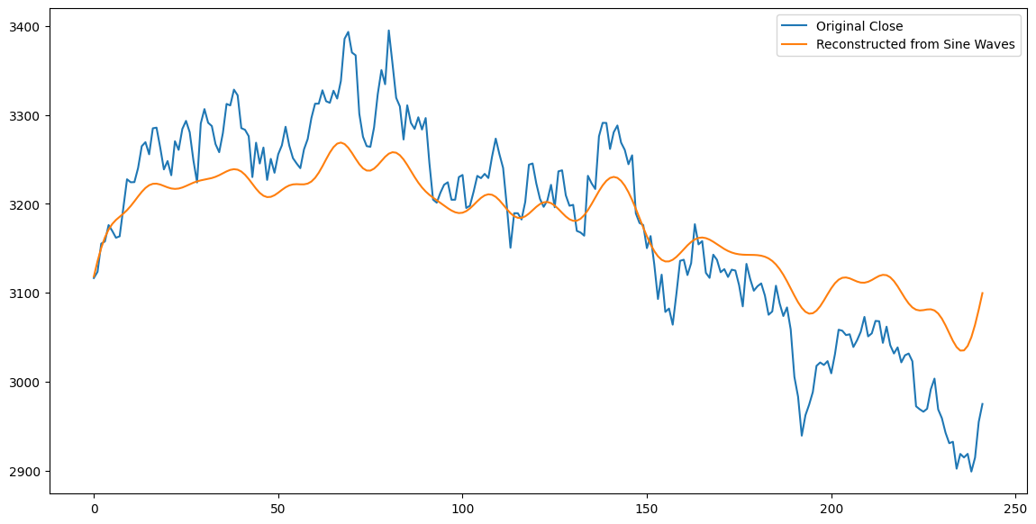
In the field of digital signal processing, time-series data is referred to as time-domain signals, while the result after Fourier Transform is a frequency-domain signal. Time-domain and frequency-domain signals are mutually convertible. The fft library in Numpy provides fft and ifft functions to facilitate these transformations.
np.fft.fft transforms time-domain signals into frequency-domain signals. The result is a complex array representing the amplitude (energy) of each decomposed frequency component. Frequencies are arranged from low to high; the 0th element has a frequency of 0, representing the DC component, which is a linear function of the signal's mean.
np.fft.ifft is the inverse transform of fft, converting frequency-domain signals back into time-domain signals.
Transforming time-domain signals to the frequency domain reveals fundamental characteristics such as periodicity. We can also perform operations on the frequency-domain signals obtained from the FFT and then transform them back, which constitutes digital signal processing.
High-Frequency Filtering and Compression
If we set the energy of high-frequency signals to zero and inverse-transform the signal back, we obtain a new sequence similar to the original but smoother—this is the essence of low-pass filtering. Various moving averages you are familiar with are also low-pass filters.
In the code above, by retaining only the energy of the first 20 low-frequency signals, we obtained a new sequence similar to the original. If this method were applied to the image domain, it would achieve lossy compression—with a compression ratio of 250/20.
In the 1990s, the most advanced image compression algorithms were based on this principle: retaining the mid-to-low frequency components of an image while treating high-frequency components as noise to be removed. This preserves the image's main features while significantly reducing the data volume to be stored.
Those working on such compression algorithms at the time knew this beautiful woman—Lena. This photo is the standard test sample for image algorithms. Through long-term evolution, under survival pressure, humans developed superhuman abilities to recognize others' expressions. Therefore, compared to other samples, if compression degrades image quality, the human eye is more likely to detect changes in faces and expressions. Thus, facial images became the best test samples.

Model Lena was a Playgirl model. This photo is a small portion of a seductive shot she took for the November 1972 issue of Playgirl. In the original photo, Lena boldly displayed her seductive hip curves, but those "unserious" scientists only shared her smile with us—which, from a research perspective, is also the part with the highest information ratio. Coincidentally, before Lena became the standard test sample for digital image processing, scientists used photos of another woman, also from Playgirl.
Enough about that. We have just shared a method to remove high-frequency noise from signals, thereby highlighting the signal's core meaning. We also hope to use similar techniques in securities analysis to reveal signals hidden within K-line charts.
However, if we simply copy methods from other fields, it hardly constitutes research, and results are likely to be poor. In fact, for securities signals, we should focus more on signal energy than frequency, after all, we want to stand on the side of the most powerful players.

Therefore, we change our approach: we retain the parts with the strongest energy in the decomposed frequency-domain signals and observe their characteristics.
Filtering Low-Energy Signals
# Retain the top 5 signals with the strongest energy
amp_threshold = np.sort(np.abs(fft_result))[-11]
# Plot individual sine wave components
plt.figure(figsize=(14, 7))
theforce = []
for freq in freqs:
if freq == 0: # Handle DC component
continue
elif freq < 0:
continue
else:
amp = np.abs(fft_result[np.where(freqs == freq)])
if amp < amp_threshold:
continue
sine_wave = amp * np.sin(2 * np.pi * freq * np.arange(len(close)))
theforce.append(sine_wave)
plt.plot(dates, sine_wave, label=f'Frequency={freq:.2f}')
plt.legend()
plt.title('Individual Sine Wave Components')
ticks = np.arange(0, len(dates), 20)
labels_to_show = [dates[i] for i in ticks]
plt.xticks(ticks=ticks, labels=labels_to_show, rotation=45)
plt.show()The FFT always yields frequencies in positive-negative pairs. We can simply consider negative frequencies as meaningless to us—dark energy we cannot see and need not care about. Therefore, in the code, we ignore this part.
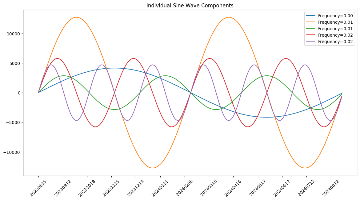
We observe that the wave with the strongest impact on the SSE index trend (orange) has a cycle of approximately 7 months: it takes 3.5 months from peak to trough, and another 3.5 months from trough to peak. Since its energy is nearly double that of other waves, it dominates the trend of the entire superimposed wave: if other waves are in phase with it, the superposition strengthens the trend; conversely, it cancels out the trend. The other waves have similar energy levels but different frequencies.
What exactly are these waves? They may represent economic cycles, but ultimately, economic cycles are driven by people or reflect human judgment. Therefore, we can view the cycle of fluctuations as the operational cycle of capital.
From this decomposition diagram, we can hypothesize that there is long-term capital (corresponding to the blue wave) that rebalances positions once a year or so. There is medium-term capital (corresponding to the orange wave) that rebalances approximately every six months. Other capital represents short-term funds, changing positions roughly every three months. There are countless high-frequency waves we have filtered out; they trade frequently, likely corresponding to retail investors, but their energy is small and generally negligible. Only on extremely rare occasions do they superimpose in the same direction to influence the trend.
Now, let us synthesize the operations of these capital flows and compare them with the actual trend to see how it goes:
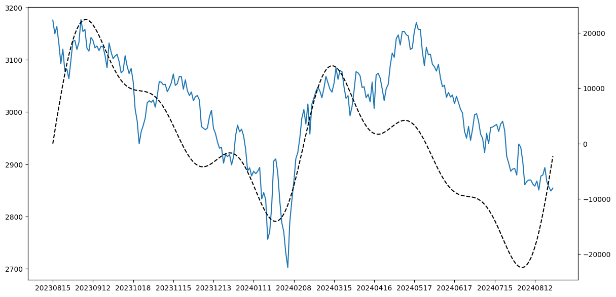
The large-cycle trends match almost perfectly, indicating that these capital flows essentially dictate the market's direction. Moreover, we seem able to assert that between March 15 and May 17, a divergence trend appeared between stock prices and main force capital: main force capital was withdrawing, while retail investors continued to operate. Thus, despite the stock price rising, the ultimate direction is determined by main force capital.
tip
The black line is synthesized from main force capital waves (having predictive power for the future). Before the market undergoes fundamental changes, main force capital's operational style is relatively fixed, so it may possess some short-term predictive capability. If we accept this conclusion, we should note another divergence at the end: retail investors are still exiting, but main force capital has entered. Of course, please do not take this too seriously.I previously believed that the DC component indicated the trend of asset prices. However, all waves are actually horizontal—yet only commodity markets are truly horizontal; stock markets are essentially upward-trending. Therefore, the DC component cannot indicate the trend of asset prices.
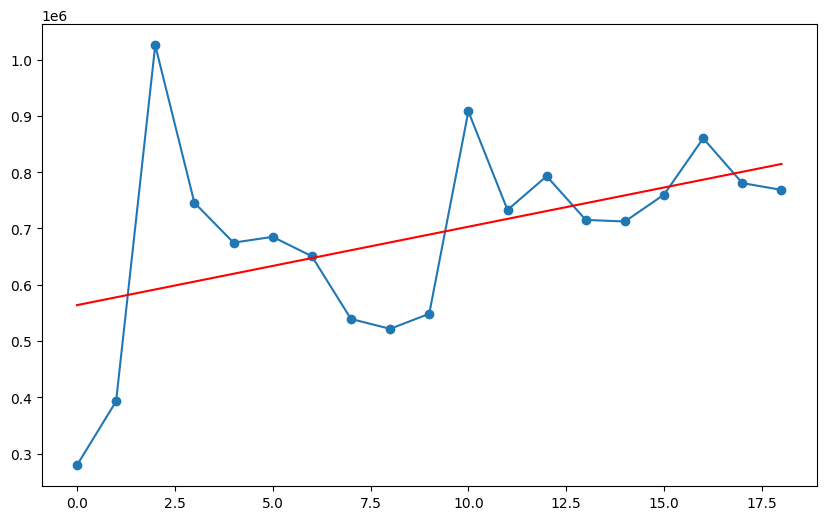
It was only today that a sudden idea struck me: if you segment a longer time-series signal and perform FFT decomposition, you will obtain several DC components. The regression line of these DC components is the trend of asset prices.
Here are three hypotheses:
- If the energy distribution across various frequencies does not change significantly after segmented decomposition, it indicates that the composition of investors and their operational styles have not changed significantly. We can use FFT to predict short-term future trends until the condition no longer holds.
- The DC component of the SSE Index over the past 30 years should perfectly fit a trend line, with its slope equal to that of the SSE Index's 20-year regression line.
- Securities prices are a combination of the DC component trend line and a series of sine waves.
Below, we prove the second hypothesis (process omitted). Finally, we plot the DC component and trend line as shown below:
And the annual lines and trend line of China A-shares since 2005 are as follows:

It is not just "similar"; it is almost identical.
The p-value for the trend line fit is approximately 0.055, which basically meets the 0.05 confidence level requirement.
The reproduction code for this article has been uploaded to our course environment. Joining our paid quantitative research circle will grant you access.
This article is part of our Factor Analysis and Machine Learning Strategies course, specifically in the section on exploring new factor methodologies. Some key results obtained from FFT transformations will serve as features for training machine learning strategies. See you in class for more content!