
How Quants Use Jupyter: JupySQL Queries & Faster EDA
When we work in Jupyter, our main goal is usually to explore data. This post shows how to query data with JupySQL — even as a replacement for Navicat, DBeaver, or pgAdmin. We'll also cover more agile ways to explore data — tools that can save you 90% of your coding time.
JupySQL - Replace Your Database Client
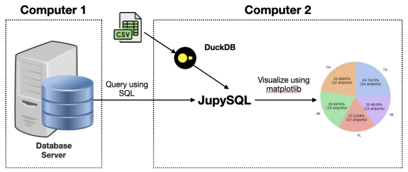
JupySQL is a SQL query tool that runs inside Jupyter. It supports traditional relational databases (PostgreSQL, MySQL, SQL Server), columnar stores (ClickHouse), data warehouses (Snowflake, BigQuery, Redshift, etc.) and embedded databases (SQLite, DuckDB).
We used to hunt for a separate query tool for every database, and finding one that is open-source, free, and actually good is harder than it sounds. Some tools are also fiddly to set up — Tabix, for example, the open-source web-based client for ClickHouse. It looks so simple it needs no installation, yet that unfamiliar model creates a learning curve at first. With JupySQL, you can manage everything with concepts you already know: a database connection string and SQL statements.
Beyond querying, another highlight of JupySQL is its built-in visualization. That's handy for quickly checking data characteristics.
Installing JupySQL
Now, open a notebook and run the following command to install JupySQL:
%pip install jupysql duckdb-engine --quietYou may have used pip like this before:
! pip install jupysqlAfter covering Jupyter magics in the previous post, you now know that %pip is a line magic.
Obviously, for JupySQL to connect to a given database, you need that database's driver. The example below uses DuckDB, so we install duckdb-engine.
info
DuckDB is an extremely fast embedded database with modern SQL syntax. In tests, it comfortably handles datasets up to 500GB while matching the performance of any commercial database.JupySQL ships as an extension. To use it, load it with a Jupyter magic first, then execute SQL with the %sql magic:
%load_ext sql
# 连接 DUCKDB。下面的连接串表明我们将使用内存数据库
%sql duckdb://
# 这一行的输出结果为 1,表明 JUPYSQL 正常工作了
%sql select 1Querying Data (DDL and DML)
But let's get to something more substantial. We downloaded a sample file of historical valuations for China A-shares from baostock.com. The file is in Excel format, which we read into a DataFrame with pandas before querying:
import pandas as pd
df = pd.read_excel("/data/.common/valuation.xlsx")
%load_ext sql
# 创建一个内存数据库实例
%sql duckdb://
# 我们将这个 DATAFRAME 存入到 DUCKDB 中
%sql --persist dfNow let's see what tables are in the database and what columns they have:
# 列出数据库中有哪些表
%sqlcmd tables
# 列出表'DF'有哪些列
%sqlcmd columns -t dfThe last command outputs:
| name | type | nullable | default | autoincrement | comment |
|---|---|---|---|---|---|
| index | BIGINT | True | None | False | None |
| date | VARCHAR | True | None | False | None |
| code | VARCHAR | True | None | False | None |
| close | DOUBLE PRECISION | True | None | False | None |
| peTTM | DOUBLE PRECISION | True | None | False | None |
| pbMRQ | DOUBLE PRECISION | True | None | False | None |
| psTTM | DOUBLE PRECISION | True | None | False | None |
| pcfNcfTTM | DOUBLE PRECISION | True | None | False | None |
As a data analyst or quant researcher, these commands cover most of the DDL operations you need day to day. In pgAdmin, finding a table means expanding nodes all the way down servers > server > databases > database > Schema > public > Tables before you can even list the table you want — tedious. JupySQL commands are much simpler.
Now, let's preview the table:
%sql select * from df limit 5We get:
| index | date | code | close | peTTM | pbMRQ | psTTM | pcfNcfTTM |
|---|---|---|---|---|---|---|---|
| 0 | 2022-09-01 | sh.600000 | 7.23 | 3.978631 | 0.370617 | 1.103792 | 1.103792 |
| 1 | 2022-09-02 | sh.600000 | 7.21 | 3.967625 | 0.369592 | 1.100739 | 1.100739 |
| 2 | 2022-09-05 | sh.600000 | 7.26 | 3.99514 | 0.372155 | 1.108372 | 1.108372 |
| 3 | 2022-09-06 | sh.600000 | 7.26 | 3.99514 | 0.372155 | 1.108372 | 1.108372 |
| 4 | 2022-09-07 | sh.600000 | 7.22 | 3.973128 | 0.370105 | 1.102266 | 1.102266 |
%sql is a line magic. We can also use cell magic to build more complex statements:
# EXAMPLE-1
%%sql --save agg_pe
select code, min(peTTM), max(peTTM), mean(peTTM)
from df
group by codeWith cell-magic syntax, the whole cell is treated as SQL, which makes it easier to format complex queries. Here we also pass the --save agg_pe option after %%sql to save this longer but potentially reusable query for later use.
tip
Once JupySQL is installed, a Format SQL button appears in the toolbar. If a cell contains SQL, clicking it formats the statement with syntax highlighting.%sqlcmd snippetsThis lists all queries we have saved, including the agg_pe we just created. We can then reuse the snippet via %sqlcmd:
query = %sqlcmd snippets agg_pe
# 这将打印出我们刚刚保存的查询片段
print(query)
# 这将执行我们保存的代码片段
%sql {{query}}It returns the same result as example-1. Few database management tools can match this workflow for simplicity!
Visualization in JupySQL
JupySQL also offers simple plots to help explore distributions.
%sqlplot histogram -t df -c peTTM pbMRQJupySQL supports box, bar, pie, and histogram.
Super-Sized Visualization Tools
However, JupySQL's visualization is not that powerful — call it a medium. There are dedicated tools that use a pandas DataFrame as the carrier and bundle editing, filtering, analysis, and visualization. This category includes Qgrid (from Quantopian), PandasGUI, D-Tale and mitosheet. D-Tale is so full-featured that if the others are venti, D-Tale is the bucket.
We'll start with Qgrid — coming from Quantopian, you'd expect it to include the analysis features quant researchers use most. They gave a presentation on Youtube showing how to use Qgrid to explore data boundaries. But since Quantopian shut down, none of these tools are maintained anymore, so we won't dwell on them.
PandasGUI launches from a notebook, but its UI is drawn with Qt, so once started it gets its own dedicated window and runs as a standalone app. It also seems to require Windows.
Mitosheet has a very polished UI. After installation, you need to restart the jupyterlab/notebook server. Restarting the kernel alone is not enough, because the UI itself is modified.
After restart, a “New Mitosheet” button appears in the notebook toolbar. Click it to insert a new cell containing:
import mitosheet
mitosheet.sheet(analysis_to_replay="id-sjmynxdlon")And that cell is run automatically to bring up the mito UI. Here is an example of visualization in mito:
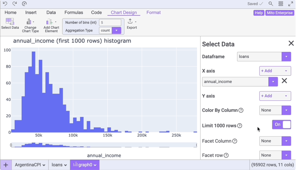
mito comes in free and pro editions, and it seems to upload data to its servers for analysis, so it doesn't feel particularly snappy when accessed from inside China.
Compared with the tools above, D-Tale doesn't seem to have these drawbacks.
In a notebook, install dtale via pip install dtale. After installation, restart the kernel. Then run:
import dtale
dtale.show(df)This loads the following UI:
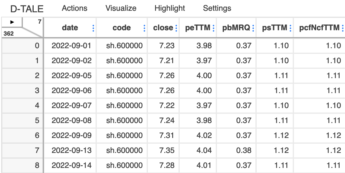
Click the small triangle arrow in the top-left corner to show the menu:
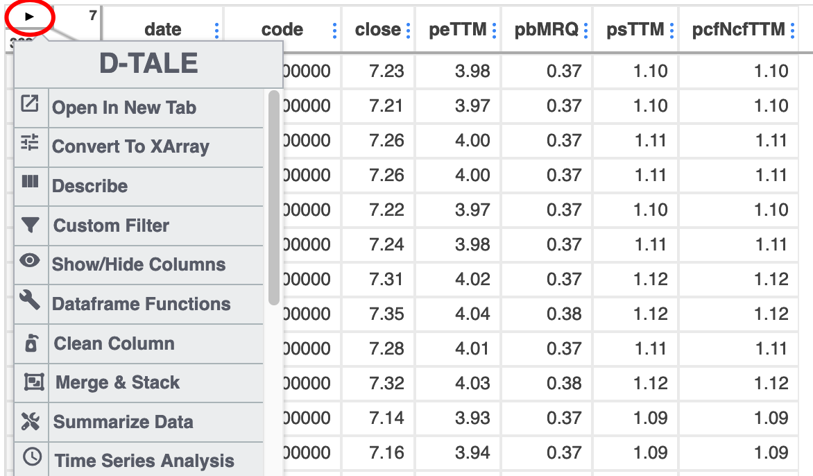
Click the describe menu item — it is considerably more powerful than df.describe. While df.describe only gives mean, quartiles, variance, min and max, dtale also reports diff, outlier, kurtosis, and skew, and draws histograms and Q-Q plots (to check for normality).
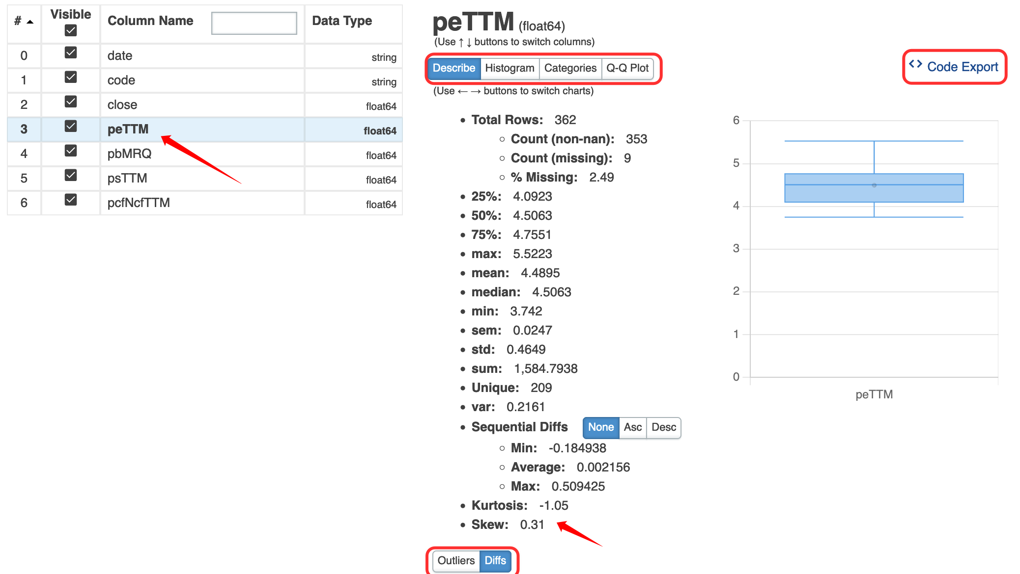
Note that you can export the code used for these calculations! That's genuinely beginner-friendly for data analysis.
This is the exported code for the QQ plot:
# DISCLAIMER: 'DF' REFERS TO THE DATA YOU PASSED IN WHEN CALLING 'DTALE.SHOW'
import numpy as np
import pandas as pd
import plotly.graph_objs as goif isinstance(df, (pd.DatetimeIndex, pd.MultiIndex)):
df = df.to_frame(index=False)
# REMOVE ANY PRE-EXISTING INDICES FOR EASE OF USE IN THE D-TALE CODE, BUT THIS IS NOT REQUIRED
df = df.reset_index().drop('index', axis=1, errors='ignore')
df.columns = [str(c) for c in df.columns] # update columns to strings in case they are numbers
s = df[~pd.isnull(df['peTTM'])]['peTTM']
import scipy.stats as sts
import plotly.express as px
qq_x, qq_y = sts.probplot(s, dist="norm", fit=False)
chart = px.scatter(x=qq_x, y=qq_y, trendline='ols', trendline_color_override='red')
figure = go.Figure(data=chart, layout=go.Layout({
'legend': {'orientation': 'h'}, 'title': {'text': 'peTTM QQ Plot'}
}))
With this feature, if you don't know how to draw a particular chart in plotly, you can load the data into dtale, draw it there, and export the code. For quants, the hardest chart to get right is probably the candlestick chart. D-Tale can do that too.
Finally, dtale actually ships with its own server. You don't have to use it inside a notebook. After installing dtale, you can run the dtale command from the terminal and then open a browser window. For more detail, see this Chinese guide.