Top 6 Color Palette Tools for Web Designers
Creating presentations in PowerPoint can be exhausting due to the complexity of animating slides. That’s why I discovered Slidev. While Slidev is excellent, it requires manual color selection, which led me down a rabbit hole of color exploration.
Today, I’m sharing some of the most vibrant websites I’ve used for color inspiration.
Adobe Color
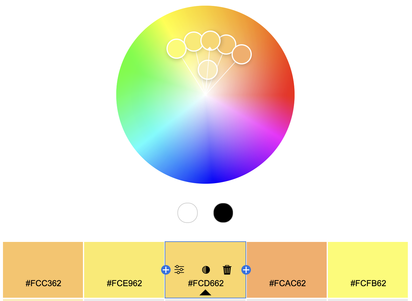
First is the most renowned, Adobe Color.
It leverages color theory to provide common color combinations and their transformations. It may feel traditional, but classics never fade.
Zhongguose -- Chinese Colors
I was particularly fond of the stage design for the "Only This Green" performance during the Spring Festival Gala. It features a classic Chinese color palette. You can find similar palettes on Zhongguose.
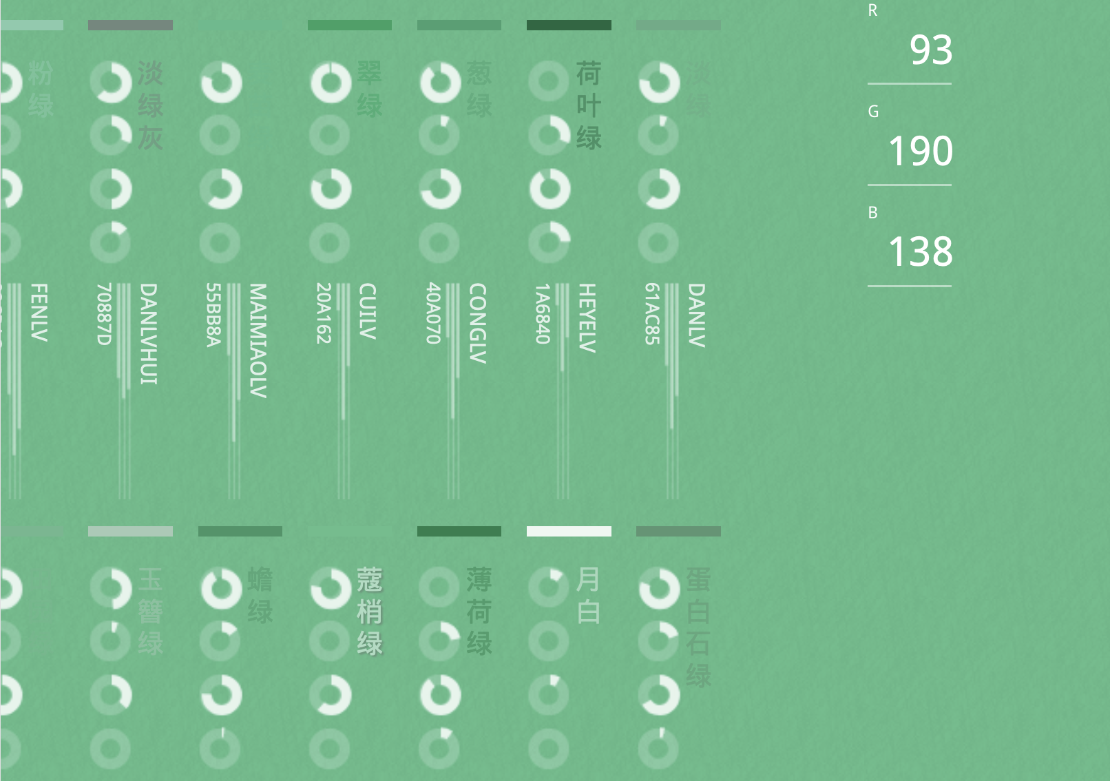
Its colors are drawn from scenes and objects familiar to Chinese people. The names alone evoke a sense of ancient elegance and beauty. Examples include "Distant Mountain Green," "Albizia Red," "Amaranth Red," and "Dark Plum Purple," instantly transporting you back to childhood memories. The highest level of art is to create emotional resonance and synesthesia with people. These designers truly understand design.
Coolors
Coolors.co is an outstanding color palette website. It features a powerful "card-drawing" mode where you can generate random color combinations simply by pressing the spacebar.
Indeed, color is a subjective and emotional matter. If it feels right, it’s right; it’s not a precise numerical game. Instead of meticulous planning, sometimes it’s better to follow intuition.
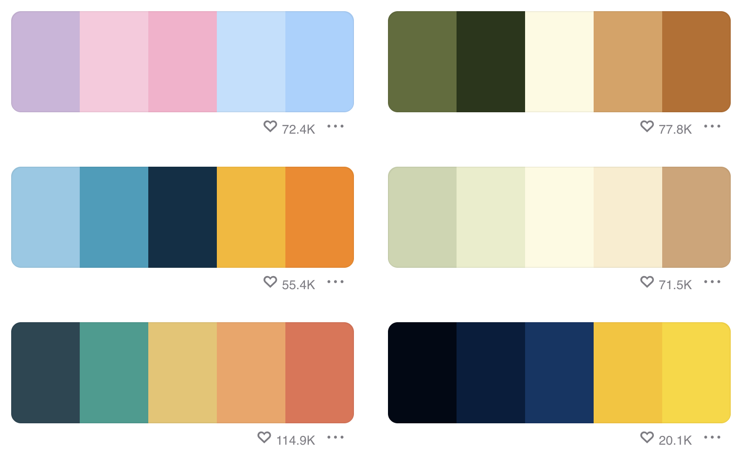
Colorion
Colorion is similar to Coolors, offering pre-generated high-quality color combinations.
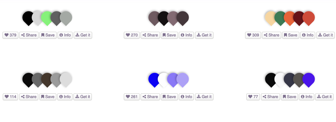
If you’re tired of Coolors, you can try your luck here.
The Beauty of Transitions
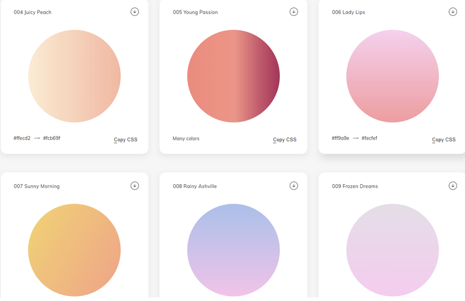
Gradients often create a dreamy and enchanting effect. This is the tempting beauty that Web Gradients can offer.
0to255
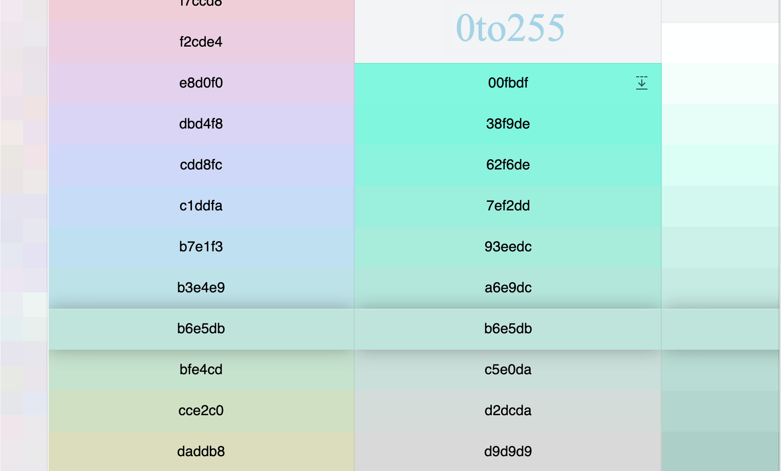
The name of this website is interesting. In the RGB color space, each color channel’s value ranges from 0 to 255, hence the name 0to255.
Recently, I came across a phrase that may have been related to the opening ceremony of the Paris Olympics. Big data pushed this phrase to the forefront: "Less is more." I won’t delve into its alternative interpretations; just associate it with the opening ceremony as you wish. I think there is a translation that captures the essence beautifully: "Partial fulfillment surpasses perfection" (though it may slightly lack literal accuracy).
However, many people, including myself, highly value the "Less is more" philosophy.
The 0to255 website embodies this design concept. It uses only one color, varying saturation and brightness to create combinations with different depths and tones. It is both concise and rich.