
Predicting Market Tops and Bottoms with XGBoost
In the previous article, we labeled tops and bottoms on the CSI 1000 index. In this post, we'll use that labeled data to predict tops and bottoms with machine learning, and explore some of the underlying ML principles.
Our features are very simple — upper/lower shadows and a variant of WR (Williams %R). We picked these two based on a June 2020 report by Gao Zijian at Soochow Securities: Shadows: Candles or Williams?.
Their conclusion was that a composite factor built from variants of these two indicators, tested on the full A-share universe from 2009 to April 2020 with a 5-group layered long-short backtest, delivered an annualized return of 15.86% with a max drawdown of only 3.68% — a remarkably strong signal.
info
 In this experiment, we will use XGBoost.It was developed by Tianqi Chen, a 2006 graduate of Shanghai Jiao Tong University's ACM Class and a PhD from the University of Washington. He is now an assistant professor at Carnegie Mellon University.
Besides XGBoost, he is also the developer of MXNet, once one of the four major deep learning frameworks alongside TensorFlow, PyTorch and others.
The header image shows the Carnegie Mellon campus, where Chen now teaches.
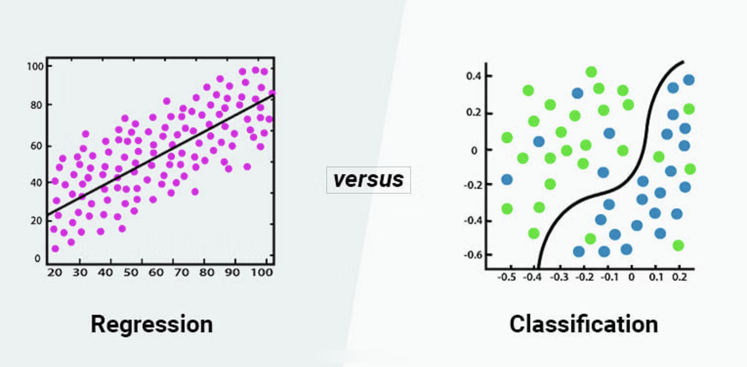
In practice, though, things are always more complicated. Beginners often assume that because stock prices live in a continuous real-valued space, predicting prices must be a regression problem to be solved with a neural network like LSTM. In reality, given the noise in financial data, that approach doesn't make much sense.
Arguably, only when building an asset pricing model can you treat it as regression — that is, pinning down a company's market cap from fundamentals and macro indicators, and then backing out the share price. That is essentially the same problem as predicting house prices in Los Angeles.
What if we want to build a predictive signal in the time-series direction? The only viable approach is probably the one used here: don't try to predict the move or price of every bar. Instead, predict tops and bottoms, so you end up buying at the bottom and selling at the top.
Installing XGBoost
We normally install its Python package via conda, although pip (version 21.3 or higher required) works too.
conda install -c conda-forge py-xgboostOn Windows, you also need to install the VC redistributable.
If your machine has a CUDA-enabled GPU, conda will automatically install an XGBoost build with GPU support.
However, GPU acceleration for XGBoost is nowhere near as dramatic as it is for CNN-style neural networks. In other words, even with a GPU, XGBoost only uses it in certain stages, for an overall speedup of a few times at best. Given how small our labeled dataset is, that speedup doesn't matter.
Constructing the Data
After labeling tops and bottoms, we already have data in the following format:
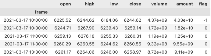
This file includes labels (the flag column), but not the feature-engineered data we need. So we first have to extract features from OHLC data.
We'll start with the simplest features — upper/lower shadows and a variant of WR (Williams %R). We chose these two based on the June 2020 report by Gao Zijian at Soochow Securities: Shadows: Candles or Williams?.
Their conclusion was that a composite factor built from the tr variant of these two indicators, tested on the full A-share universe from 2009 to April 2020 with a 5-group layered long-short backtest, delivered an annualized return of 15.86% with a max drawdown of only 3.68% — a remarkably strong signal.

Building on that foundation, we'll redo it with machine learning. Here is how we extract the upper/lower shadows and WR:
def wr_up(bars):
h, c, l = bars["high"], bars["low"], bars["close"]
shadow = h - c
# 技巧:避免产生除零错误,且不影响结果正确
return shadow/(h - l + 1e-7)
def wr_down(bars):
h, c, l = bars["high"], bars["low"], bars["close"]
shadow = c - l
return shadow/(h - l + 1e-7)
def upper_shadow(bars):
h, c, l = bars["high"], bars["low"], bars["close"]
o = bars["open"]
shadow = h - np.maximum(o, c)
return shadow/(h - l + 1e-7)
def lower_shadow(bars):
h, c, l = bars["high"], bars["low"], bars["close"]
o = bars["open"]
shadow = np.minimum(o, c) - l
return shadow/(h - l + 1e-7)XGBoost is tree-based, so it doesn't really require regularization of the data. Still, for easier analysis and comparison, we normalized all four indicators so their values fall in [0,1].
For upper/lower shadows, a value of 0.5 means the shadow accounts for half of the day's range. A value of 1 means the day closed as a T-line or an inverted-T (also called a gravestone).
Williams %R is an oscillator first published by American author (shameless plug — same trade as this blogger), trader and investor Larry Williams in his 1973 book How I Made One Million Dollars. Its formula is:
$$ W%R = \frac{H_n - C_n}{H_n - L_n} x 100% $$
The analogous formula for downside support is omitted here.
n is the window length, usually set to 14 days. Then $H_n$ is the highest price over the past 14 days, and so on for the other variables. If we set n to 1 day, it collapses to something very much like an upper/lower shadow indicator.
Unlike candlestick shadow calculation, it uses only the close price, rather than the greater of close and open (for the upper shadow) or the lesser (for the lower shadow).
There are a few tricks here. For example, we used maximum, one of numpy's ufuncs, to pick the larger of open and close. Another obvious approach would be:
np.select([c>o, o<c], [c, o])But using the ufunc here gives you a speedup.
Next, we can build the training dataset:
data = {
"label": raw["flag"].values,
"data": np.vstack(
(wr_up(bars),
wr_down(bars),
upper_shadow(bars),
lower_shadow(bars)
)
).T
}bars is a numpy structured array containing OHLC data and flags, converted from the earlier raw variable.
In the end we produce a dict, with training data under "data" and labels under "label". We used np.vstack to stack the features together. These functions are covered in the Numpy and Pandas for Quantitative Trading course.
Next, we bring in sklearn to split the dataset into train and test sets, then train:
from sklearn.model_selection import train_test_split
X_train, X_test, y_train, y_test =
train_test_split(..., test_size=.2)We held out 20% of the data as test data.
bst = XGBClassifier(n_estimators=3, max_depth=2, learning_rate=0.5)
# fit model
bst.fit(X_train, y_train)
# make predictions
preds = bst.predict(X_test)Now training is done, and we've made predictions on the test set. Next, we want to know whether this model is any good. For that we'll bring in some metrics from sklearn.metrics:
from sklearn.metrics import *
acc = accuracy_score(y_test,preds)
print(f"ACC: {acc:.3f}")
recall = recall_score(y_test,preds, average='weighted')
print(f"Recall:{recall:.1%}")
f1 = f1_score(y_test,preds, average='weighted')
print(f"F1-score: {f1:.1%}")
pre = precision_score(y_test,preds, average='weighted')
print(f"Precesion:{pre:.1%}")
mx = confusion_matrix(y_test,preds)The results look perfect:
ACC: 0.930
Recall:93.0%
F1-score: 89.6%
Precesion:86.5%But do these numbers really mean the model works? Could happiness have come too easily? So we need to dig one layer deeper to see how the predictions actually behave. When analyzing predictions over a large sample, we have a powerful tool called the confusion matrix.
tip
There is an old joke about confusion. In a beauty pageant, a contestant was asked to explain this famous saying by Confucius (Confucius):"Reading without meditating is a useless occupation (学而不思则惘)". Clearly she had no idea who Confucius was, so she guessed from the sound of the name that Confucius was one of the men who invented confusion. Still, the Doctrine of the Mean can indeed leave you confused, so crediting Confucius with inventing confusion isn't entirely off the mark.sns.heatmap(mx/np.sum(mx), cmap="YlGnBu",
annot=True, fmt=".1%")We'll get a chart like this:
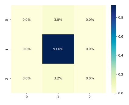
This chart shows: about 3.8% of class-0 data was misclassified as label 1; about 3.2% of class-2 data was misclassified as label 1; all class-1 data was correctly classified as 1.
From this chart we can also tell this is a heavily imbalanced dataset. But it failed to correctly identify the classes we care about most — class 0 (corresponding to flag = -1) and class 2 (corresponding to flag = 1). Of course, it didn't go so far as to mistake class 0 for class 2, or vice versa.
Still, it's a good start. As we add more rows and more features to the training data, and make the classes more evenly distributed, this model is bound to improve.
But before we improve it, we need to master more theory about XGBoost and evaluation metrics. See you next time!