Pandas Styler & Plotting: Data Visualization for Quants
Pandas DataFrames offer robust styling capabilities, enabling Excel-like conditional formatting via the Styler object. Additionally, Pandas’ built-in plotting methods support a wide range of chart types, effortlessly meeting data visualization requirements.
1. Tables and Styling
Pandas DataFrames provide powerful styling features, allowing for Excel-like conditional coloring through the Styler object. Below are key methods and examples:
1.1. Basic Styling
Access styling features via DataFrame.style, which supports chained method calls:
df.style.set_caption("标题").set_properties(**{'background-color': 'lightgray'})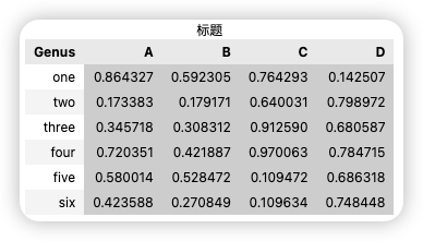
1.2. Conditional Coloring
1.2.1. Single-Column Conditional Coloring
def color_negative_red(val):
color = 'red' if val < 0.2 else 'black'
return f'color: {color}'
df.style.applymap(color_negative_red)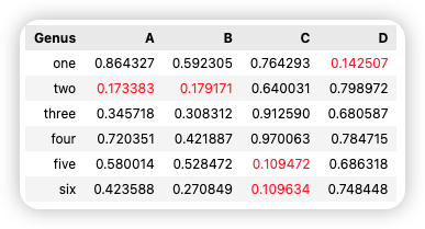
1.2.2. Multi-Column Conditional Coloring
df.style.apply(lambda x: ['background: yellow' if v > 0.2 else '' for v in x],
subset=['A', 'C'])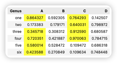
1.2.3. Highlighting Extremes
df.style.highlight_max(color='lightgreen').highlight_min(color='pink')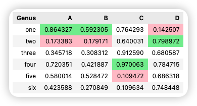
1.2.4. Gradient Backgrounds
df.style.background_gradient(cmap='Blues', subset=['B'])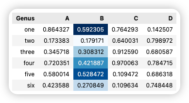
1.2.5. Bar Chart Styling
df.style.bar(subset=['C'], color='#5fba7d')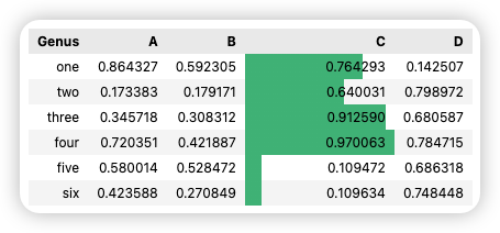
1.2.6. Custom Table Styles
headers = {'selector': 'th',
'props': 'background-color: #5e17eb; color: white;'}
df.style.set_table_styles([headers])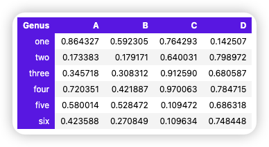
1.2.7. Dynamic Conditional Coloring (Complex Logic)
def highlight_risk(row):
# 当A列>90且B列<50时标黄
return ['background: yellow' if (row['A']>0.3) &
(row['B']<0.5) else '' for _ in row] # 返回与行等长的样式列表
df.style.apply(highlight_risk, axis=1) # axis=1表示按行处理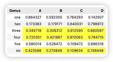
Notes
- Styling only applies in Jupyter Notebooks or when exported to HTML; it does not modify the underlying data. - Use the `subset` parameter to restrict the coloring scope. - Gradient backgrounds (`background_gradient`) allow adjustment of the color scale range (`low=0.2, high=0.8`).2. Pandas Built-in Plotting
In Pandas, we often deal with multi-column data along with row and column labels. Pandas includes built-in methods to simplify plotting from DataFrames and Series.
2.1. Line Charts
Both Series and DataFrame objects have a plot attribute for creating basic charts. By default, plot() generates line charts.
s = pd.Series(np.random.standard_normal(10).cumsum(), index=np.arange(0, 100, 10))
s.plot()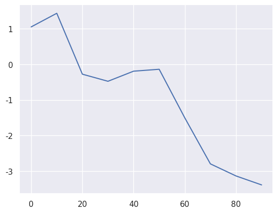
The index of the Series object is passed to Matplotlib and used to plot the x-axis. You can disable index usage with use_index=False. X-axis ticks and limits can be adjusted via xticks and xlim, while the y-axis is controlled by yticks and ylim. A partial list of plot parameters is shown in the table below:
| Parameter | Description |
|---|---|
| alpha | Transparency of the plot fill (between 0 and 1) |
| ax | Matplotlib Axes object; defaults to the current Axes (gca()) |
| colormap | Specifies the color map (e.g., 'viridis') |
| figsize | Image size in format (width, height) (in inches) |
| fontsize | Font size for tick labels |
| grid | Whether to display grid lines (defaults to None, following Matplotlib’s default style) |
| kind | Plot type: 'line' (line chart, default), 'bar' (bar chart), 'barh' (horizontal bar chart), 'hist' (histogram), 'box' (box plot), 'kde'/'density' (kernel density estimate), 'area' (area chart), 'pie' (pie chart) |
| label | Legend label name |
| legend | Whether to display the legend (default is False) |
| logx/logy | Whether to use logarithmic scales for the x/y axis (default is False) |
| loglog | Whether to use logarithmic scales for both x and y axes |
| position | Position of bars in bar charts (avoid conflict with kind='bar') |
| rot | Rotation angle for tick labels (e.g., 45 for 45 degrees) |
| secondary_y | Whether to use a second y-axis on the right (default is False) |
| style | Line style (e.g., 'k--' for black dashed line) |
| table | Whether to display a data table below the chart (default is False) |
| title | Chart title (string) |
| use_index | Whether to use the Series index as x-axis tick labels (default is True) |
| xerr/yerr | Add error bars to bar charts |
| xlim/ylim | Set x/y-axis display range (format: (min, max)) |
| xticks/yticks | Customize x/y-axis tick values (list) |
| **kwds | Other Matplotlib plotting parameters (e.g., color='red') |
Most Pandas plotting methods accept an optional ax parameter, which can be a Matplotlib subplot object, allowing for more flexible positioning of subplots within a grid layout.
The DataFrame’s plot method draws each column as a line in the same subplot and automatically creates a legend.
df = pd.DataFrame(np.random.standard_normal((10, 4)).cumsum(0),
columns=['A', 'B', 'C', 'D'],
index=np.arange(0, 100, 10))
plt.style.use('grayscale')
df.plot()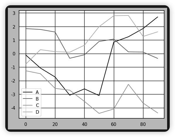
Notes
Here, `plt.style.use('grayscale')` is used to set the color scheme to grayscale.Notes
Additional keyword arguments passed to `plot` are forwarded to the corresponding Matplotlib plotting function. Therefore, further customization of charts requires deeper knowledge of the Matplotlib API.| Parameter | Description |
|---|---|
| subplots | Whether to create subplots for each column (default is False) |
| sharex | If subplots=True, whether to share the x-axis (default is True when ax=None) |
| sharey | If subplots=True, whether to share the y-axis (default is False) |
| layout | Subplot row/column layout in format (rows, columns) |
| legend | Add legends to subplots (default is True) |
| sort_columns | Whether to sort columns by name (default is False) |
2.2. Bar Charts
plot.bar() and plot.barh() are used to draw vertical and horizontal bar charts, respectively. For bar charts, the index of the Series or DataFrame is used as the tick marks on the x-axis (for bar) or y-axis (for barh).
fig, axes = plt.subplots(2,1)
data = pd.Series(np.random.uniform(size=16), index=list('abcdefghijklmnop'))
data.plot.bar(ax=axes[0], color='k', alpha=0.7)
data.plot.barh(ax=axes[1], color='k', alpha=0.7)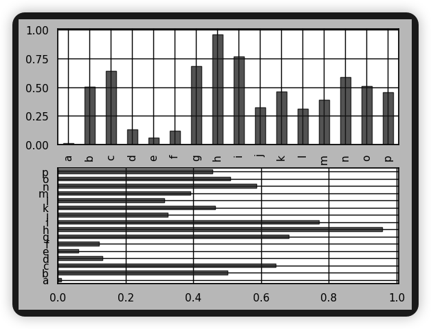
For DataFrames, bar charts group the values of each row and display them side by side.
df = pd.DataFrame(np.random.uniform(size=(6, 4)),
index=["one", "two", "three", "four", "five", "six"],
columns=pd.Index(["A", "B", "C", "D"], name="Genus"))
df.plot.bar()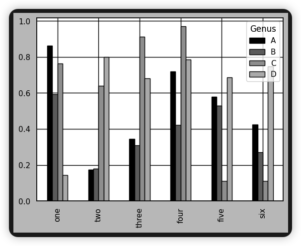
Note that the column name "Genus" is used as the legend title.
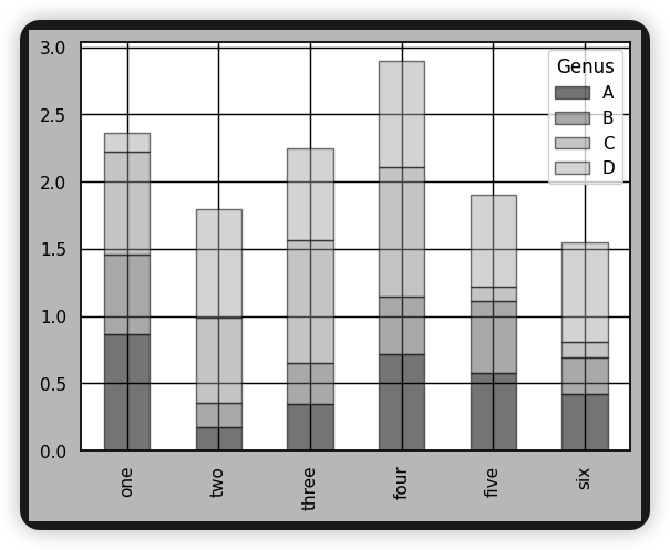
Passing stacked=True generates a stacked bar chart for the DataFrame, where the values of each row are stacked horizontally.
df.plot.bar(stacked=True,alpha=0.5)