
Using Q-Q Plots for Statistical Inference
Principles
Suppose we have a random variable and want to determine if it follows a specific distribution. Can we use visualization to make this judgment?
To address this, we use a Q-Q plot (Quantile-Quantile plot), also known as a quantile plot. It is a crucial tool for visual statistical inference.
First, consider the following facts:
- If $X$ is a dataset, the plot of $[X, X]$ in a 2D plane will be a scatter plot falling entirely on a 45-degree line;
- If we have another dataset $Y$, and after sorting $X$ and $Y$, the elements $X_i$ and $Y_i$ at any coordinate position $i$ are exactly equal, we will obtain the same graph;
- If $X_i$ and $Y_i$ at any coordinate position $i$ are approximately equal, we will obtain a scatter plot distributed near the 45-degree line.
X = stats.norm.rvs(size=1000)
Y = stats.norm.rvs(size=1000)
plt.scatter(sorted(X), sorted(Y), s=1)
plt.plot(X, X, color='orange')In the example above, we sampled twice from a standard normal distribution to obtain $X$ and $Y$. After sorting them, we plotted the results, yielding a scatter plot distributed around the 45-degree line.
This example essentially provides an algorithm to determine whether a distribution belongs to the standard normal distribution. We need to explain why, for $X$ and $Y$ belonging to the same distribution, the elements at corresponding positions should be roughly equal after sorting. This requires introducing the concept of quantiles.
If we have a random variable $X$ that follows a standard normal distribution, the sample point $x_1$ at the 50th percentile should be very close to 0 (since it is a random variable, it is unlikely to be exactly equal). This is because the value of a standard normal distribution at the 50th percentile is 0. Extending this to the 25th and 75th percentiles, the values of $X$ at these quantiles should also be very close to those of the standard normal distribution. Furthermore, at any quantile, the sampled values of both should be very close.
Therefore, by sampling $X$ and the standard normal distribution separately according to quantiles and plotting them, we obtain a scatter plot distributed around the 45-degree line.
In practice, we simplify the above algorithm by avoiding explicit quantile calculations and instead using sorting. After sorting $X$ and $Y$, if the total sample size is $N$, the $n$-th element in the sorted sequence is considered the value of the random variable at the $n/N$ quantile. If $X_n$ and $Y_n$ at the $n$-th position are very close, the point $[X_n, Y_n]$ will fall near the line $Y = X$, i.e., the 45-degree line.
This simplification is fully effective when $n$ is large; however, significant deviations may occur when $n$ is small.
The following code demonstrates the plotting process as $n$ doubles from 10 to 1280:
fig, axes = plt.subplots(nrows=2, ncols=4, figsize=(16,8))
axes = axes.flatten()
for i, n in enumerate((10, 20, 40, 80, 160, 320, 640, 1280)):
X = stats.norm.rvs(size=n)
Y = stats.norm.rvs(size=n)
ax = axes[i]
ax.scatter(sorted(stats.zscore(X)), sorted(Y), s=3)
ax.plot(X, X, '--', color='grey')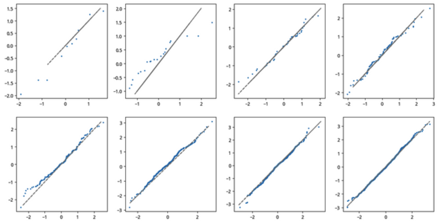
From the figure, we can see that when $n \ge 320$, most points fall near the line.
Testing for Arbitrary Normal Distributions
If $X$ follows a normal distribution $norm(loc, scale)$, plotting $[X, Y]$ will result in a scatter plot distributed around the line $Y = (X - loc)/scale$.
np.random.seed(78)
loc = 5
scale = 3
X = stats.norm.rvs(loc=loc, scale = scale, size=1000)
Y = stats.norm.rvs(size=1000)
plt.scatter(sorted(X), sorted(Y), s=1)
plt.plot(X, X, color='orange')
x2 = np.linspace(min(X), max(X), len(X))
y2 = x2 / scale - loc / scale
plt.plot(x2, y2, color='cyan')
plt.text(5, 5, "[X,X]")
plt.text(10, 2, "[X,Y]", color='blue')
plt.text(10, 3.5, "[X, (X-loc)/scale]", color='red')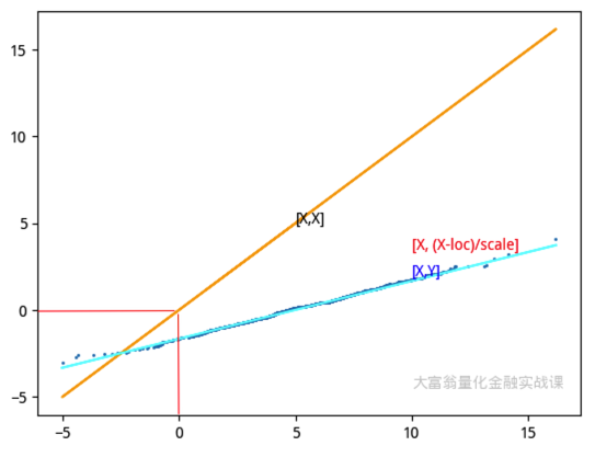
Alternatively, we can first z-score $X$ and then plot it against samples from the standard normal distribution. If $X$ follows a normal distribution, the resulting plot will still show most points distributed around the $y=x$ line.
Libraries for Q-Q Plots
The previous code snippets demonstrated the plotting method, primarily to illustrate the principles. In practical applications, we can use the probplot method from scipy.stats:
import numpy as np
import scipy.stats as stats
import matplotlib.pyplot as plt
# GENERATE A RANDOM DATASET FOLLOWING A NORMAL DISTRIBUTION
np.random.seed(0)
data = np.random.normal(loc=5, scale=2, size=100)
# GENERATE A Q-Q PLOT
plt.figure(figsize=(8, 8))
stats.probplot(data, dist="norm", plot=plt)
plt.title('Q-Q plot')
plt.ylabel('Sample quantiles (样本分位数)')
plt.xlabel('Theoretical quantiles (理论分位数)')
plt.grid(True)
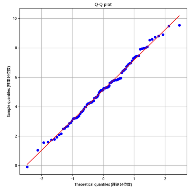
plt.show()As we now understand, the probplot method simply generates theoretical distribution samples of the same length based on the dist parameter provided, sorts both the tested distribution and the theoretical distribution, and then plots the regression line and scatter points.
The above code generates the following plot:
Additionally, the statsmodels library provides the qqplot method via graphics.gofplots.