
XGBoost Time-Series Attribution: Diagnosing Outages
When a system—such as a trading engine or a server base station—crashes unexpectedly, can we act like detectives, sifting through massive monitoring data to identify the "culprit" behind the incident? This was a question recently posed by one of our students.
This article uses a real-world "base station outage" case to demonstrate how to perform time-series event attribution using the machine learning model XGBoost. While this problem may seem unrelated to quantitative finance, its core idea—identifying key drivers among multiple potential factors (time-series factors)—is identical to multi-factor models in quantitative investing.
Our "crime scene" data is as follows:
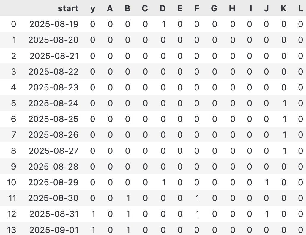 Anonymized monitoring data
Here, column Y is our target: 1 indicates a base station outage, and 0 indicates normal operation. Columns A through L are Boolean values for various monitoring metrics. On August 31, the base station unfortunately went down. Faced with a sea of 0s and 1s, we need to answer:
- Which combination of factors caused the failure?
- Is a single anomaly or continuous multi-day anomalies more fatal?
- Can we build a model to predict future risks?
At first glance, we notice seemingly contradictory records, suggesting that failures may be probabilistic. This is precisely where machine learning shines, particularly with XGBoost, renowned as the "king of tabular data."
Defining the Problem: Making XGBoost Understand Time
To make XGBoost understand "the past N days," we cannot simply feed it a matrix of data within a time window. XGBoost processes tabular data, where each row represents an independent sample and each column is a feature.
Therefore, we must "flatten" the time series, converting all monitoring values from the past N days into a long, one-dimensional feature vector. This process is called feature engineering, serving as the critical bridge between time-series data and machine learning models.
Specifically, for the sample on day i, its feature vector $X_i$ is formed by concatenating the values of all monitoring indicators A through L from the past n days:
$$ \begin{equation} X_i = [A_{i-n}, ..., A_{i-1}, B_{i-n}, ..., B_{i-1}, ..., L_{i-n}, ..., L_{i-1}] \end{equation} $$
The following Python code implements this transformation:
def expand_data(df: pd.DataFrame, n: int) -> pd.DataFrame:
"""
Expands a time-series dataframe into a feature matrix with n lag features.
Args:
df: The input dataframe with a time index and feature columns.
n: The number of time steps to look back.
Returns:
A new dataframe where each row contains the original data plus
lagged features from the past n steps.
"""
if n <= 0:
base_cols = [c for c in ['start', 'y'] if c in df.columns]
return df[base_cols].copy()
# Identify feature columns (assumed to be uppercase letters)
cols = list(df.columns)
if 'A' in cols:
start_idx = cols.index('A')
feat_cols = cols[start_idx:]
else:
feat_candidates = {c for c in cols if c.isalpha() and c.upper() == c}
feat_cols = [c for c in cols if c in feat_candidates]
base_cols = [c for c in ['start', 'y'] if c in df.columns]
# Build lag features using vectorized shift for efficiency
out = {}
for col in feat_cols:
s = df[col]
for k in range(1, n + 1):
out[f'{col}_{k}'] = s.shift(k)
features = pd.DataFrame(out, index=df.index)
res = pd.concat([df[base_cols], features], axis=1)
# Trim rows with NaN values resulting from the shift operation
trimmed = res.iloc[n:].reset_index(drop=True)
return trimmed
df = pd.read_csv(data_home/"ro/drama.csv")
expanded_df = expand_data(df, 5)
expanded_df.head()Taking n=3 as an example, the transformed data looks like this, where each row contains information for the current day (y) as well as all indicators (A_1 to L_3) from the past 3 days:
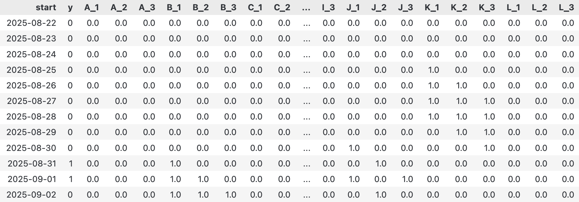 Expanded feature matrix
Training: Bringing Out XGBoost
With the data prepared, we can bring in the protagonist—XGBoost. The training process is very straightforward. We use XGBClassifier, selecting a loss function suitable for binary classification (such as binary:logistic) and an evaluation metric (such as logloss).
import numpy as np
import pandas as pd
from xgboost import XGBClassifier
def train_xgb_and_rank_features(
df: pd.DataFrame,
n_estimators: int = 400,
max_depth: int = 5,
learning_rate: float = 0.05,
**kwargs
):
"""
Trains an XGBoost classifier on the given dataframe.
Args:
df: The feature matrix.
n_estimators, max_depth, learning_rate: XGBoost hyperparameters.
Returns:
A trained XGBoost classifier instance.
"""
# 1. Separate features (X) and target (y)
feat_cols = list(set(df.columns) - set(["y", "start"]))
X = df[feat_cols].apply(pd.to_numeric, errors="coerce")
y = pd.to_numeric(df["y"], errors="ignore")
# 2. Clean data by dropping rows with any NaN values
mask = X.notna().all(axis=1) & pd.notna(y)
X, y = X.loc[mask], y.loc[mask]
# 3. Set up XGBoost parameters
params = dict(
n_estimators=n_estimators,
max_depth=max_depth,
learning_rate=learning_rate,
objective="binary:logistic",
eval_metric="logloss",
n_jobs=0,
tree_method="hist",
random_state=42,
**kwargs
)
clf = XGBClassifier(**params)
clf.fit(X, y)
return clf
clf = train_xgb_and_rank_features(expanded_df)
clfAfter training, the model has learned the complex relationships between various features and "outages." Next comes the moment to unveil the mystery.
Attribution Analysis: Global and Local
Global Importance: Who is the Key Suspect?
First, we can examine the global importance (gain) of each feature using the model's get_booster().get_score() method. This tells us which features contribute most to distinguishing between "normal" and "outage" from the model's perspective.
def get_feature_importance(clf, df):
"""Extracts and sorts feature importance from a trained XGBoost model."""
booster = clf.get_booster()
score = booster.get_score(importance_type="gain")
feat_columns = list(set(df.columns) - set(["y", "start"]))
imp_df = pd.DataFrame([(name, score.get(name, 0.0)) for name in feat_columns],
columns=["feature", "importance"])
imp_df = imp_df.sort_values("importance", ascending=False).reset_index(drop=True)
return imp_df
get_feature_importance(clf, expanded_df).head()In our case, the results might show that K_2 (the K indicator from two days ago) has significantly higher importance than other features, making it the primary "suspect." It also shows that K_1 (the K indicator from one day ago) contributes to this.
To further verify its "guilt," we can conduct a "thought experiment" using a Partial Dependence Plot (PDP). The logic of PDP is: assuming we can control variables, when all other features remain unchanged, how does the model's average predicted probability change if we only alter the value of feature K_1 (from 0 to 1)? This helps isolate and understand the pure impact of a single feature on the final result.
from sklearn.inspection import partial_dependence
feat_columns = list(set(expanded_df.columns) - set(["y", "start"]))
X = expanded_df[feat_columns]
pd_results = partial_dependence(clf, X, features=["K_1", "K_2"])
pd_resultsLet's plot this result as a heatmap to discuss further:
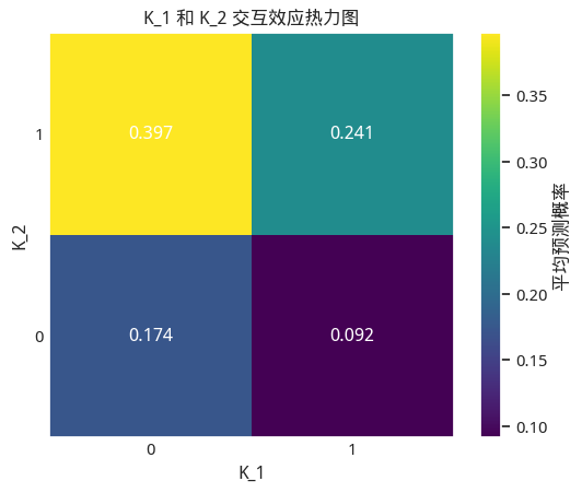 Interaction heatmap for K_1 and K_2
The results are quite interesting!
- If there was an anomaly two days ago but normal operation yesterday, the risk is highest, reaching nearly 40%. This is somewhat counter-intuitive.
- Strong interaction effect: The impact of
K_1(yesterday's status) depends entirely onK_2(the day before yesterday's status).- If the day before yesterday was normal (
K_2=0), then an anomaly yesterday (K_1=1) actually decreases the risk from 17.4% to 9.2%. - If the day before yesterday was abnormal (
K_2=1), then continuing the anomaly yesterday (K_1=1) decreases the risk from 39.7% to 24.1%. - This suggests that a "persistent" anomaly signal is less dangerous than a "just recovered" anomaly signal.
- If the day before yesterday was normal (
- The safest scenario: When the day before yesterday was normal and yesterday was abnormal (
K_2=0, K_1=1), the risk probability is actually the lowest, at only 9.2%.
attention
It is necessary to emphasize that I only have 19 records. It is not surprising to see such strange results.Global analysis tells us that K_2 is important and K_1 has some contribution, but this is not enough. For "event attribution," we care more about: on the day the base station crashed on August 31, what role did each factor play? Which feature values ultimately led to the "death"?
This is what local explainability addresses, and SHAP (SHapley Additive exPlanations) is the best tool for this problem. It clearly shows, for a single prediction, whether each feature value was a "pusher" or a "puller," and how much each contributed.
Let's focus on the sample from the day of the "incident" and use SHAP for a "forensic audit."
import shap
def explain(clf, Xi):
shap.initjs()
# 1. Create explainer
# TreeExplainer is an efficient explainer optimized for tree models (like XGBoost)
explainer = shap.TreeExplainer(clf)
# 2. Calculate SHAP values
shap_values = explainer.shap_values(Xi)
# 3. Visualize local attribution - Waterfall plot
shap.waterfall_plot(
shap.Explanation(
values=shap_values[0],
base_values=explainer.expected_value,
data=Xi.iloc[0],
feature_names=X.columns.tolist(),
)
)
# The day before yesterday, the base station crashed
Xi = expanded_df[feat_columns][-2:-1]
explain(clf, Xi)
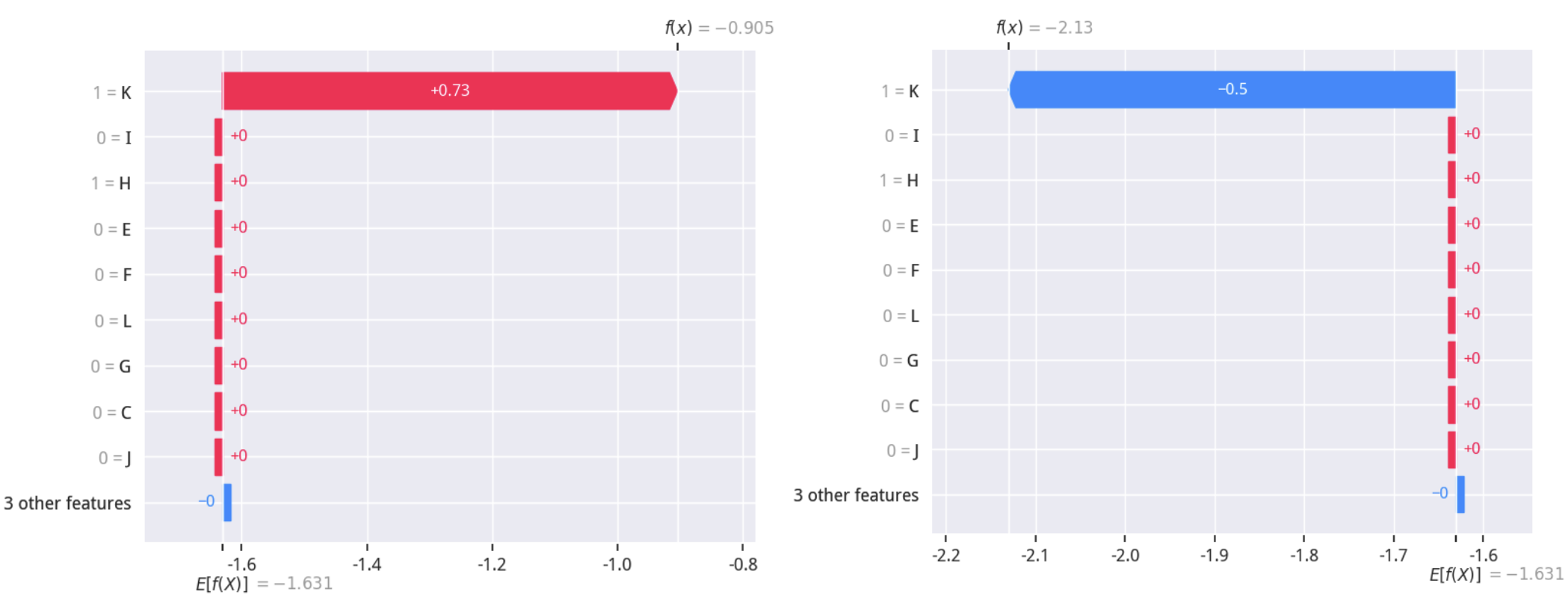
The output diagram is called a SHAP Waterfall plot. How to interpret it?
E[f(X)]is the model's baseline value, representing the average predicted probability of all samples. However, since the output here is log-odds, it needs to be converted to probability using the formula $p = \frac{1}{1 + e^{-E[f(X)]}}$. The current value converts to approximately 21%, meaning that based on the known data, the probability of the base station crashing is about 21%.- The chart starts from the baseline value and displays the contribution of each feature (SHAP value) from bottom to top.
- Red bars indicate that the current value of the feature pushed up the final predicted probability (risk factor).
- Blue bars indicate that the current value of the feature pulled down the final predicted probability (safety factor).
- The contributions of all features add up, pushing the prediction from the baseline value
E[f(X)]to the final predicted valuef(x)for that sample (top right).
Through the left diagram, we can clearly see that on the day of the outage, K_1=1 was the main culprit causing a significant increase in the predicted probability. This provides the most direct and microscopic evidence for our attribution analysis.
Now, we can output which factors caused the base station to crash on days where y = 1: simply find the columns in shap_values that are greater than 0, convert the indices to the corresponding days, and output them:
| Failure Date | Failure Cause and Occurrence Date | Description |
|---|---|---|
| August 31 | August 30, factor k | i.e., K_1 = 1 |
| August 29, factor k | i.e., K_2 = 1 |
Model Reflection: The Correct Relationship Between XGBoost and Time Series
Is "flattening" time-series data and feeding it to XGBoost always effective?
The answer is: It depends on what kind of "time-series data" we are facing.
XGBoost itself cannot directly learn autocorrelation, trends, or seasonality in time series. It treats each feature (such as K_1, K_2) independently and cannot understand that K_1 is "yesterday" relative to K_2. Therefore, if the core of the data lies in continuous temporal dynamics (such as continuous stock price fluctuations), this "flattening" operation will lose key information, and the model's performance will be significantly degraded.
However, in our base station case, this method is effective. Why? Because the "time series" here is more of an event log nature. We care about whether a specific event (such as K=1) occurred before the failure, and the timing of its occurrence (yesterday, the day before yesterday). Each lagged feature (K_1, K_2) is itself an independent event flag. The model needs to learn not the dynamic changes of the K indicator, but the correlation strength between the event K_1=1 and the failure y=1.
This leads to a core viewpoint: XGBoost cannot replace time-series analysis, but it can become a powerful "referee" for feature engineering.
In quantitative trading, we do not directly input the closing prices of the past 10 days as 10 features into the model. We first extract time-series information into indicators with economic or statistical significance through feature engineering, such as moving averages (MA), Relative Strength Index (RSI), momentum, etc. These indicators themselves are highly condensed and dimensionality-reduced representations of time series.
Then, we input these "factors" as features into XGBoost for scoring and combination. At this point, XGBoost judges whether your feature engineering is effective, rather than processing raw time series directly. If your feature