
Rocket Science for Trading: Derivatives Detect Elliott Waves & Factor Alpha

This article draws inspiration from John Ehlers, a former engineer at Lockheed Martin who worked on NASA rocket programs. With a deep background in digital signal processing (DSP), Ehlers invented Maximum Entropy Spectral Analysis (MESA) for oil exploration, providing high-resolution visualization of short-lived seismic echoes.
He later applied these methods to finance, founding MESA Software to provide analytical tools and educational services for traders.
Ehlers, alongside J.M. Hurst, is one of the pioneers in securities cycle analysis. Ehlers has also authored numerous books, including Trader’s Rocket Science.
However, Python was not invented until 1989 and did not gain widespread popularity until around the turn of the millennium. Consequently, many of Ehlers’ ideas were expressed in a language called EasyLanguage. We attempt to convey some of his concepts using Python, adding our own understanding and extensions. Finally, we introduce a factor discovered based on this methodology.
Undoubtedly, security prices are deformed periodic signals. Their fundamental trend is determined by company value, overlaid with volatility generated by trading activity.
For rapidly growing companies—such as tech stocks riding the current wave—their value curve may follow an exponential function, like Cisco in the 1990s, Microsoft around 2000, Apple later, and Nvidia today. For basic service companies, the value curve should resemble a straight line referencing GDP growth.
info
Speaking of Apple, the recently released Mac Mini 4 is quite impressive and currently in high demand. A Macbook M1 purchased a few years ago could compress mp4 videos with a 6:1 acceleration ratio; the Mac Mini 4 is estimated to achieve a 30:1 ratio or higher, meaning a 1-hour video could be encoded and compressed in under 2 minutes.The following function generates an oscillating upward price sequence, synthesized from an upward-sloping line and a sine curve.
def gen_wave_price(size, waves, slope, amp = 0.3, phase=0):
time = np.arange(size)
amp_factor = time * amp
freq = 2 * np.pi * waves / size
y = amp_factor * np.sin(freq * time + phase) + time * slope
return y
y = gen_wave_price(100, 3, 0.5, 0.25)
plt.plot(np.arange(100), y)This generates the following graph:
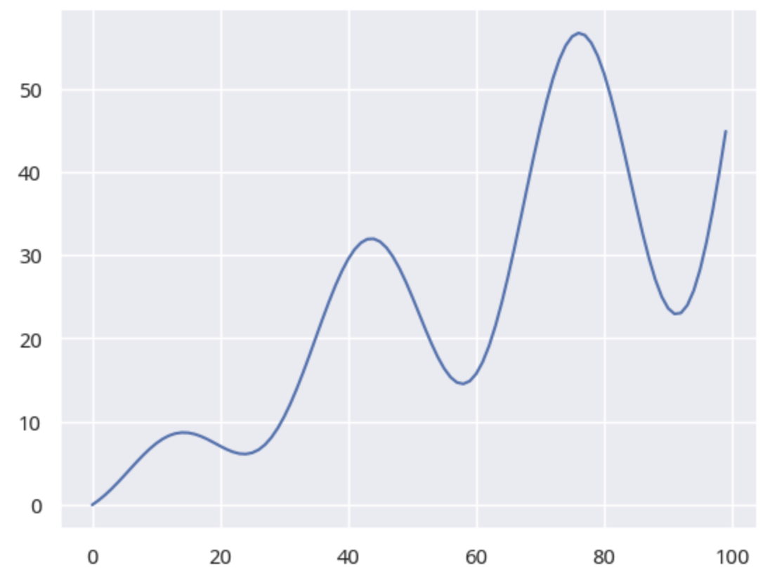 Fig 1. Oscillating Upward Trend
In fact, we have synthesized an Elliott-driven impulse wave:
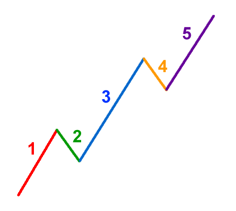 Elliott Upward 5-Wave
Synthesizing Double Tops and Head-and-Shoulders
Regarding double tops and head-and-shoulders patterns, I have robust detection algorithms. However, if you are more interested in waves, I can synthesize one using sine functions.
x = np.linspace(1, 10, 100)
y = np.sin(x) + .33 * np.sin(3*x)
plt.plot(x, y)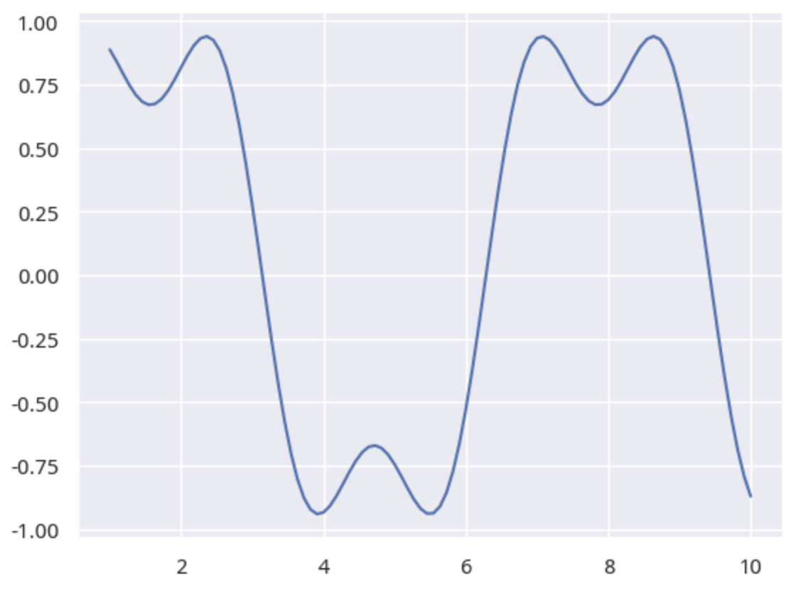 Fig 2. Double Top
A head-and-shoulders pattern requires adding one more sine wave:
x = np.linspace(1, 10, 100)
y = np.sin(x) + .1* np.sin(3*x) + .2 * np.sin(5*x)
plt.plot(x, y)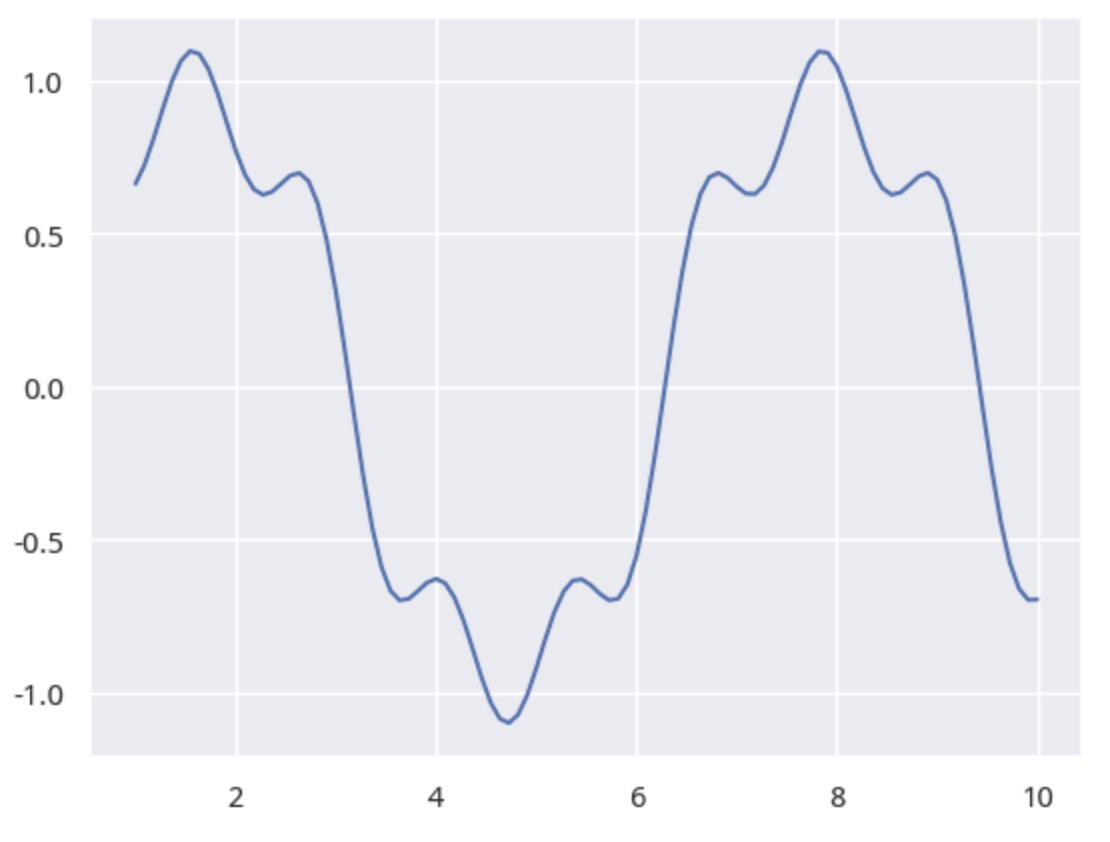 Fig 3. Head-and-Shoulders Top
To detect whether a double top exists in a stock price sequence, we can use the curve_fit function from scipy. Since $np.sin(x) + .33 * np.sin(3*x)$ can fit a double top, if we can find a similar function via curve_fit from the price sequence and then judge the parameters and estimation error, we can determine if a double top exists.
After generalization, this function should be expressed as:
from scipy.optimize import curve_fit, differential_evolution
# Function to be inferred
def model(x, a, b, c, d):
return a * np.sin(b * x) + c * np.sin(d * x)
# Objective function
def objective(params):
a, b, c, d = params
y_fit = model(x, a, b, c, d)
error = np.sum((y - y_fit) ** 2)
return error
# Inference and plotting
def inference_and_plot(x, y):
bounds = [(0, np.max(y)), (0, len(x)), (0, 1), (0, len(x))]
result = differential_evolution(objective, bounds)
initial_guess = result.x
params, params_covariance = curve_fit(model, x, y, p0=initial_guess)
plt.plot(x, y)
plt.plot(x, model(x, *params),
label='Fitted Curve',
color='red',
linewidth=2)
return params, params_covariance
# Add some noise
x = np.linspace(1, 10, 100)
y = np.sin(x) + .33* np.sin(3*x)
y += np.random.normal(0.05, 0.1, size=100)
inference_and_plot(x[60:], y[60:])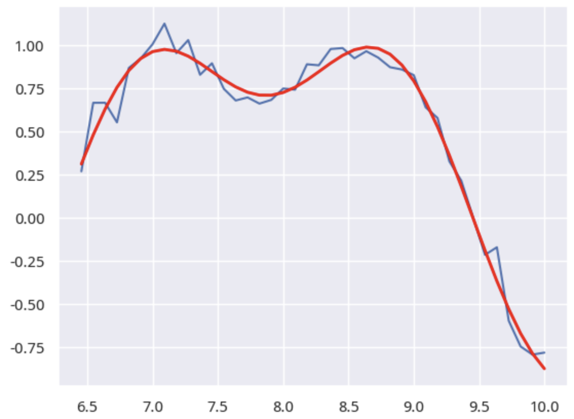 Fig 4. Double Top Inference
Here, a differential evolution algorithm is used to automatically discover parameters.
We treat the blue part as the actual stock price sequence, and the red curve is the fitted curve inferred via the differential evolution algorithm.
Waves and Derivatives
So far, we have only laid the groundwork to demonstrate that stock price sequences indeed possess wave characteristics. If so, let us utilize some wave properties.
A sine wave has an interesting property: its derivative is a cosine wave, i.e.:
$\frac{d}{dt}sin(\omega t)=(\frac{1}{\omega})\times cos(\omega t)$
After differentiation, it becomes a cosine wave with the same frequency, and a cosine wave is a sine wave with a phase advance. Let us verify this.
t = np.linspace(1, 10, 100)
# Original function
y = np.sin(t)
# Derivative function
dy = np.diff(y)
dy = np.insert(dy, 0, np.nan)
fig, ax = plt.subplots(figsize=(10,5))
line1, = ax.plot(y, label="Original Function")
ax2 = ax.twinx()
ax2.grid(False)
line2, = ax2.plot(dy, '-', color='orange', label="Derivative")
lines = [line1, line2]
labels = [line.get_label() for line in lines]
plt.legend(lines, labels, loc="upper right")
plt.show()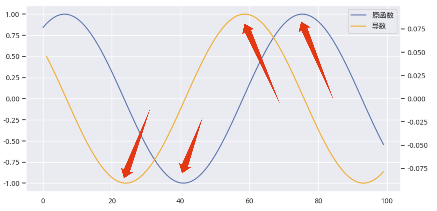 Fig 5. Relationship Between Derivative and Original Function
The blue line is the original stock price, and the yellow line is its derivative. From the graph, we can see that after differentiation, the frequency remains unchanged, the amplitude decreases, the phase advances, and every peak and trough of the yellow line corresponds to a peak and trough of the blue line later. What does this mean?
If the original function is a wave function, we can now predict peaks and troughs in advance. The figure above clearly shows this.
Almost all technical indicators are lagging indicators, but the derivative function helps us predict the arrival of peaks and troughs!
tip
Do not be shocked! In fact, many quants have already used this property in an unconscious state. For example, you have almost certainly used `np.diff` over three periods plus `np.mean`. As long as you use `np.diff` data, you are using derivatives to some extent. However, being clearly aware of this property allows us to know when to use it and when to abandon it.If the original function is a wave function, then by finding the peaks and troughs of the derivative function (using already occurred data), we can know 1/4 of a cycle in advance when the original function will reach its peaks and troughs -- the only prerequisite being that the pattern does not change within such a short period -- it will not always be so, but there are always some time periods and some instruments where the pattern indeed holds, and what you need to do is use powerful computing power to discover them as quickly as possible.
In our Factor Analysis and Machine Learning Strategies course, we will convert this property into a feature and add it to machine learning models to improve their prediction capabilities for tops and bottoms. The course is still ongoing; joining now will be at the lowest price for the next few months.
The course assistant is waiting for you here!

However, before building a machine learning model, we can first use this property to construct a factor.
I conducted factor testing on 2,000 randomly selected individual stocks from 2018 to 2023, yielding the following results:
| 1D | 5D | 10D | |
|---|---|---|---|
| Ann. alpha | 0.138 | 0.096 | 0.078 |
| beta | 0.036 | 0.064 | 0.058 |
| Mean Period Wise Return Top Quantile (bps) | -1.180 | -1.613 | -1.580 |
| Mean Period Wise Return Bottom Quantile (bps) | -15.671 | -11.045 | -9.155 |
| Mean Period Wise Spread (bps) | 14.491 | 9.531 | 7.650 |
The cumulative annualized return chart over the 6 years is as follows:
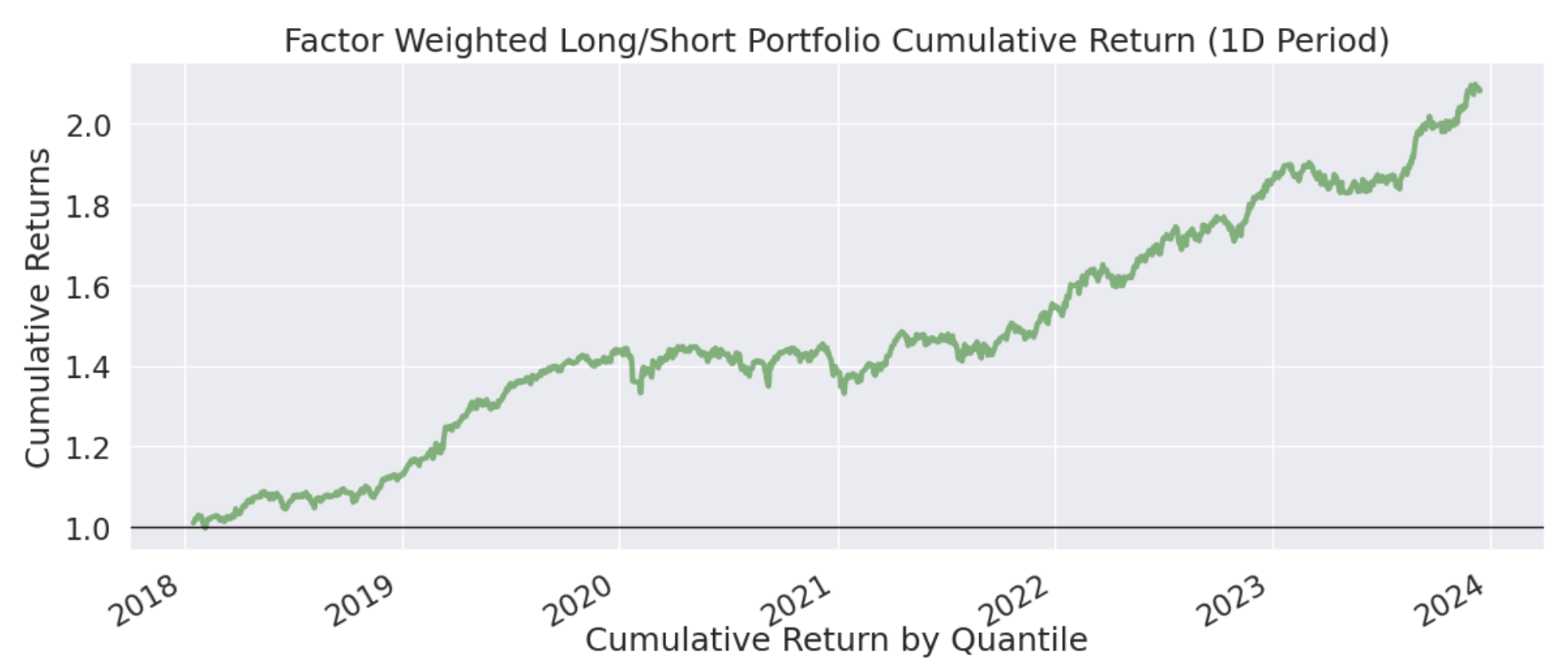 Fig 6. Cumulative Returns Chart
These returns have not yet been optimized. In fact, from the mean layered returns chart below, optimization is possible.
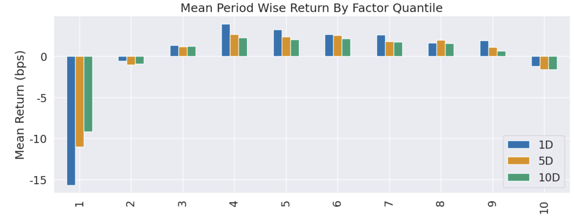 Fig 7. Mean Layered Returns Chart
We can filter out the 10th layer of factors before factor testing. After this processing, the annualized Alpha we obtain will reach 20.08%, with 6-year cumulative returns approaching 3 times.
Even for a pure long-only strategy, the annualized Alpha of this factor reaches 14%.
Factor construction and verification code will be available after joining the community.

Recurring Phase of Cycle Analysis
John Ehlers proposed a method for finding cycles in this article.
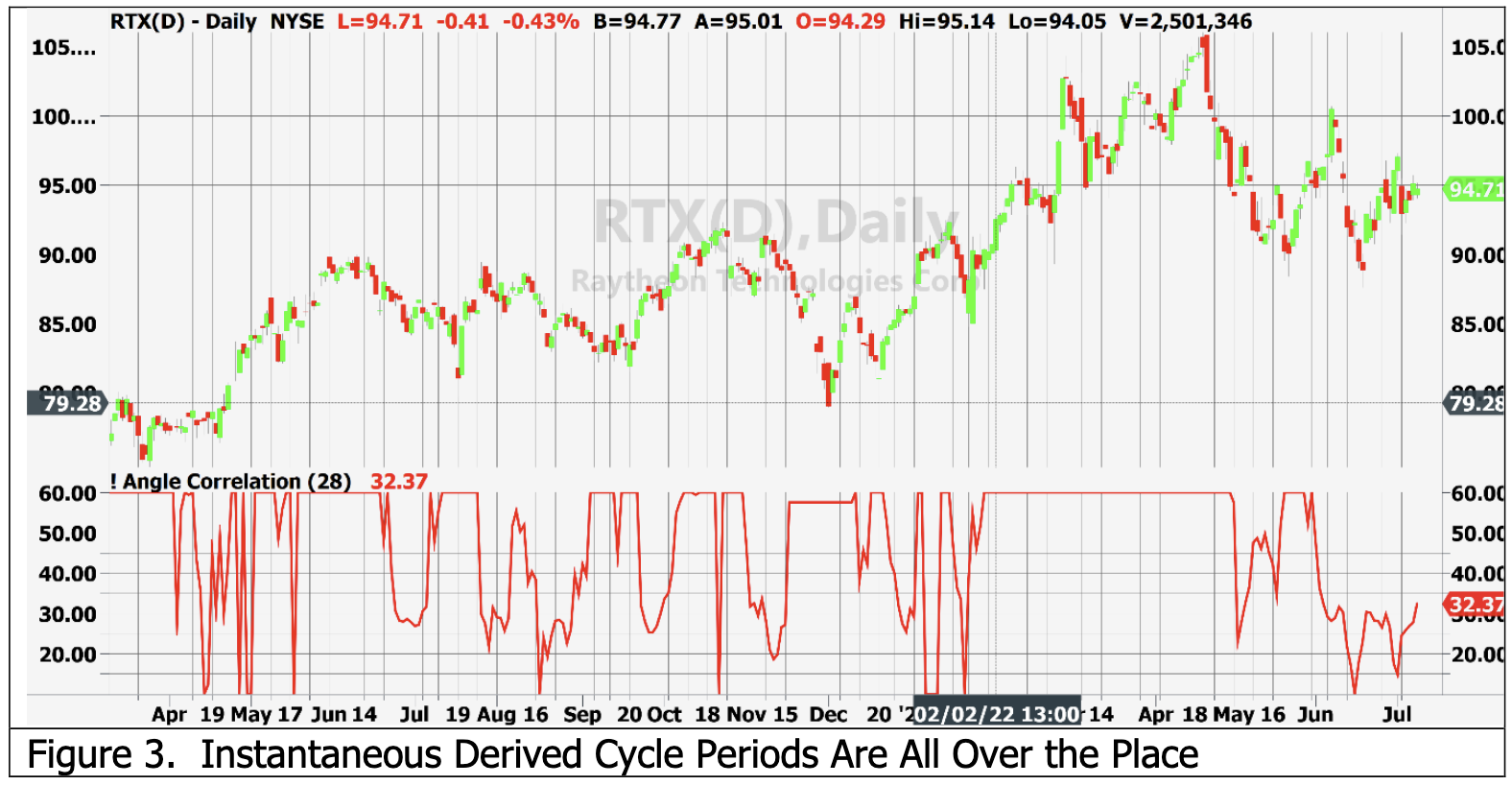 Fig 8. John Ehlers's Recurring Phase Analysis
The code uses EasyLanguage, which is not easy for me at all. I do not know how it implements FFT, nor do I understand the ubiquitous magic numbers.
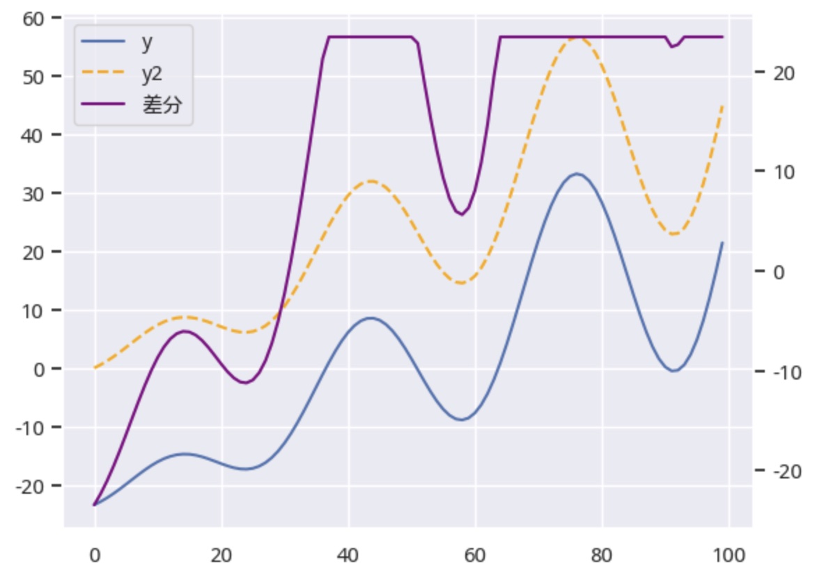
However, I have completed similar research. This research aims to reveal the significance of the DC component after FFT transformation.
After performing FFT on the time series in Fig 1, removing the DC component, and inverse-transforming back, comparing the two yields a graph like this:
 { el.textContent = (d.total_pv || 0).toLocaleString(); });
document.querySelectorAll('[data-total-uv]').forEach((el) => { el.textContent = (d.total_uv || 0).toLocaleString(); });
if (d.updated_at) {
var t = new Date(typeof d.updated_at === 'number' ? d.updated_at * 1000 : d.updated_at).toLocaleDateString();
document.querySelectorAll('[data-updated]').forEach((el) => { el.textContent = `(${t} 更新)`; });
}
var pages = d.pages || {};
var pv = pages[location.pathname];
document.querySelectorAll('[data-page-pv]').forEach((el) => { el.textContent = pv != null ? Number(pv).toLocaleString() : '—'; });
}
function renderStatic() {
fetch('/site-stats.json').then((r) => r.json()).then(render).catch(() => {});
}
renderStatic();
try {
var cached = JSON.parse(localStorage.getItem(KEY) || 'null');
var fresh = cached && (Date.now() - (cached.at || 0) < 24 * 3600 * 1000);
if (fresh) { render(cached.data); return; }
} catch (e) {}
fetch(CDN).then((r) => r.json()).then((d) => {
render(d);
try { localStorage.setItem(KEY, JSON.stringify({ at: Date.now(), data: d })); } catch (e) {}
}).catch(() => {});
})();
{ el.textContent = (d.total_pv || 0).toLocaleString(); });
document.querySelectorAll('[data-total-uv]').forEach((el) => { el.textContent = (d.total_uv || 0).toLocaleString(); });
if (d.updated_at) {
var t = new Date(typeof d.updated_at === 'number' ? d.updated_at * 1000 : d.updated_at).toLocaleDateString();
document.querySelectorAll('[data-updated]').forEach((el) => { el.textContent = `(${t} 更新)`; });
}
var pages = d.pages || {};
var pv = pages[location.pathname];
document.querySelectorAll('[data-page-pv]').forEach((el) => { el.textContent = pv != null ? Number(pv).toLocaleString() : '—'; });
}
function renderStatic() {
fetch('/site-stats.json').then((r) => r.json()).then(render).catch(() => {});
}
renderStatic();
try {
var cached = JSON.parse(localStorage.getItem(KEY) || 'null');
var fresh = cached && (Date.now() - (cached.at || 0) < 24 * 3600 * 1000);
if (fresh) { render(cached.data); return; }
} catch (e) {}
fetch(CDN).then((r) => r.json()).then((d) => {
render(d);
try { localStorage.setItem(KEY, JSON.stringify({ at: Date.now(), data: d })); } catch (e) {}
}).catch(() => {});
})();