
After 6 Limit-Ups: Finding the Next Winner With Correlation
On January 2 and 3 this year, two tourism stocks hit their daily limit-up one after another. One went on to nearly triple within a month, the other posted six consecutive limit-ups. With the benefit of hindsight, how could we have used quantitative analysis — right after the first limit-up on Jan 2 — to identify the second stock?
warning
No matter how compelling this review looks, please note: the goal here is only to share a quant technique — how to run correlation analysis. Even if the idea could be turned into a strategy, most individuals don't have the infrastructure to run such a quant system live.One Tripled, One Posted Six Straight Limit-Ups
This chart shows closing prices for the 60 days through January 17, 2024. The red dashed lines mark when each stock took off. Stock A likely rode the Dong Yuhui essay controversy and the Harbin tourism boom, breaking out first on January 2.
Although A nearly tripled in half a month, that kind of event-driven surge is still very hard to model precisely from a quant perspective. But if, after A took off, we had bought B before the close on Jan 2 — in this case B still offered an entry at the next open — riding six straight limit-ups would have been more than satisfying.
Now let's walk through the review: from A's limit-up to discovering B.
First, run the scan after 14:30, when you sweep the market for first-board limit-up stocks. Daily limit-up data is available in AKShare, which, if I recall correctly, can distinguish first-board hits from consecutive-board runs.
For each first-board stock, pull the concept sectors it belongs to. Then loop through every member of those sectors and use correlation analysis to find the most closely linked names.
tip
Concept sectors follow no strict rules. Some vendors even let users contribute to how concepts are built. Generally, compilers dig out concepts from news coverage, company filings, or Q&A with the board secretary. Take the Nvidia concept as an example: if someone asks on an investor Q&A platform, "Do you work with Nvidia?" and the secretary replies, "We bought X of their GPUs," that company could be added to the Nvidia concept, even though it has almost nothing to do with the Nvidia supply chain.In contrast, industry sectors are compiled much more rigorously, based on a company's core business.
We'll use correlation screening for this data mining.
Correlation Coefficient
In probability and statistics, correlation shows the strength and direction of the linear relationship between two or more random variables.
We typically use the correlation coefficient to measure how closely these variables move together. When they move in the same direction, it is called positive correlation; when they move in opposite directions, negative correlation.
We compute the correlation between two random variables as:
$$ \rho_{XY} = \frac{cov(X, Y)}{\sigma_X\sigma_Y} $$
This is the Pearson correlation coefficient. In practice you can compute it with corrcoef in numpy, or with scipy.stats.pearsonr.
The code below illustrates positive, negative, and zero correlation:
# x0与x1正相关, 与x2负相关, 与x3分别为不同的随机变量
x0 = np.random.normal(size=100)
x1 = 10* x0 + 1
x2 = -10 * x0 + 1
x3 = np.random.normal(size=100)
x = np.vstack((x0, x1, x2, x3))
rho = np.corrcoef(x)
fig, ax = plt.subplots(nrows=1, ncols=3, figsize=(12, 3))
for i in [0,1,2]:
ax[i].scatter(x[0,],x[1+i,])
desc = "Pearson: {:.2f}".format(rho[0,i+1])
ax[i].title.set_text(desc)
ax[i].set(xlabel='x',ylabel='y')
plt.show()When plotting, we put $x_0$ on the x-axis and $x_i$ on the y-axis. If $x_0$ and $x_1$ are perfectly positively correlated, you get a $45^。$ upward-sloping straight line. That is actually the principle behind a QQ-Plot.
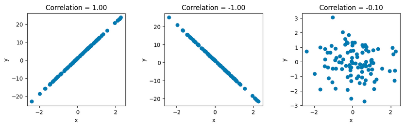
To go from the left panel to the right, just keep adding noise to $x_0$. Feel free to try it yourself.
Pearson only captures linear relationships. Often we need to relax the condition to: when target A rises, B rises too — regardless of by how much. The strength of the link doesn't depend on the magnitude. In that case, use Spearman correlation.
tip
Whether Pearson or Spearman, applied to time series like stock prices, the independence assumption for random variables isn't fully satisfied. Experience tells us, though, the violation isn't large enough to render them useless. Still, it's worth knowing. If you're up for academic papers, search StackExchange for how-to-use-pearson-correlation-correctly-with-time-series.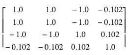
In this matrix, the diagonal holds the self-correlations, which are obviously all 1. To get the correlation between time series $s_1$ and $s_2$, take $\rho[0][1]$; for $s_1$ vs $s_3$, take $\rho[0][2]$, and so on — as you can see on line 13 of the code.
We use scipy.stats.spearmanr for Spearman correlation. We'll demonstrate it with a real-world example.
Finding Strongly Correlated Stocks
Suppose we already have the member list for the concept sector. Now compute each member's correlation with the leader one by one. If the coefficient is above 0.75, we treat it as strongly correlated and add it to the candidate pool.
The correlation coefficient is dimensionless, ranging from [-1,1]. So you can think of 0.75 as roughly the 75th-percentile level.
async def qqplot(x, y, n=60, end):
xbars = await Stock.get_bars(x, n, FrameType.DAY, end=end )
ybars = await Stock.get_bars(y, n, FrameType.DAY, end=end)
xclose = xbars["close"]
yclose = ybars["close"]
pearson = scipy.stats.pearsonr(xclose, yclose)[0]
spearman = scipy.stats.spearmanr(xclose, yclose).statistic
if pearson < 0.75:
return
a, b = np.polyfit(xclose, yclose, 1)
ax = plt.subplot(1,1,1)
ax.scatter(xclose, yclose)
ax.plot(xclose, a * xclose + b)
namex = await Security.alias(x)
namey = await Security.alias(y)
ax.title.set_text(f'{namex} <=> {namey} pearson: {pearson:.2f} spearman: {spearman:.2f}')
plt.show()Suppose it's now 2pm on Jan 2, and we can be confident Stock A won't break its limit-up. We now compute its correlation with every other stock in the sector, dropping the weakly correlated ones — if the link is weak, they won't follow the rally, nor will they follow the pullback (and following A's pullback is a must in my view).
Using pearson > 0.75 as the filter, 5 out of 22 stocks in the sector pass. Using spearman > 0.75, only 4 pass — all of them within the Pearson set. For cleaner layout, we show only those 4 overlapping names here:
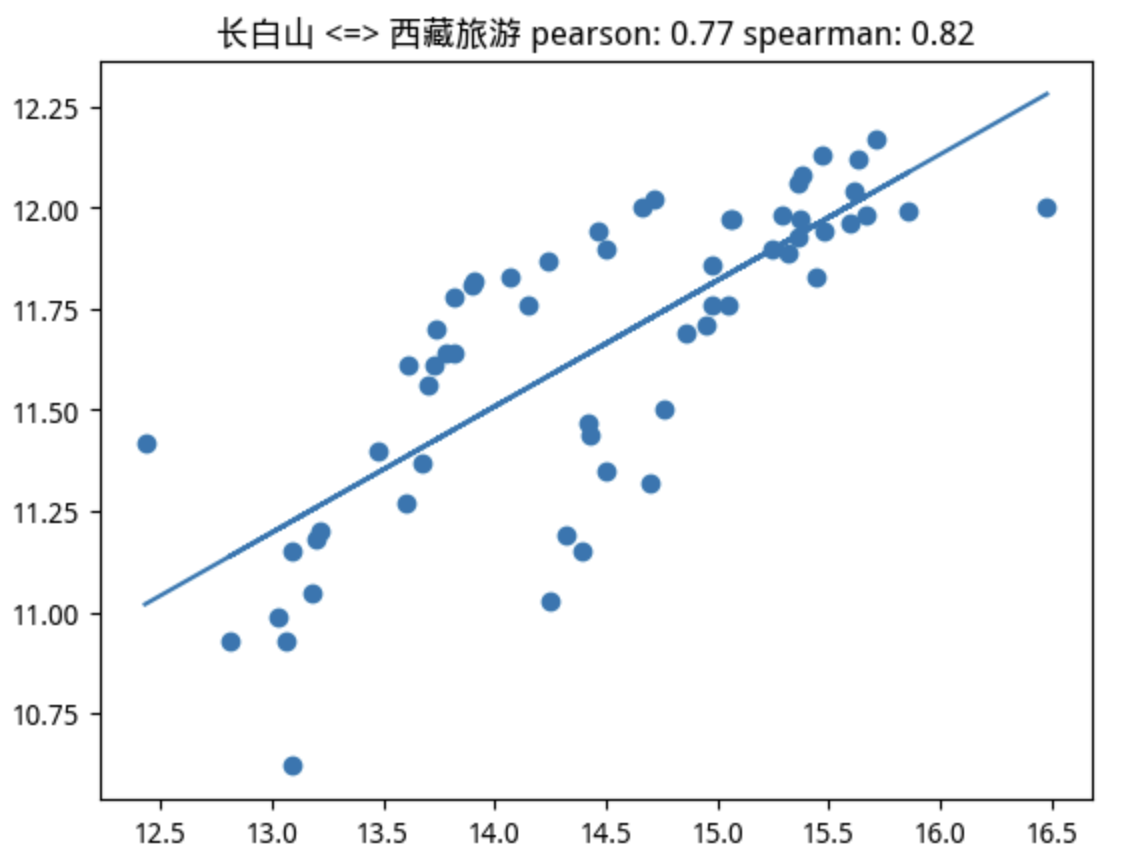
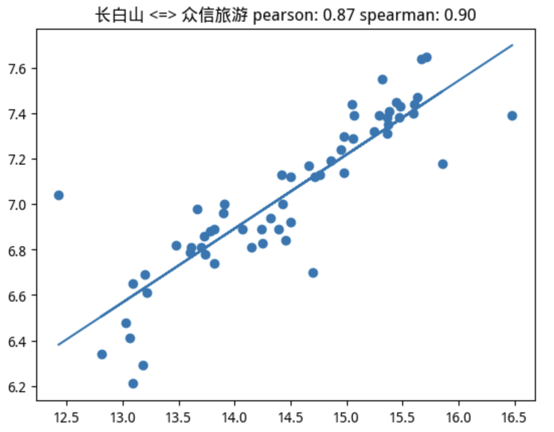
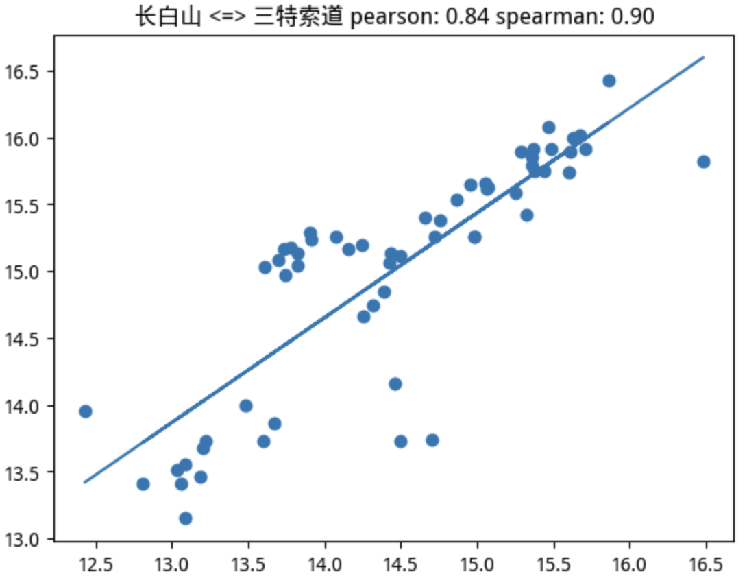
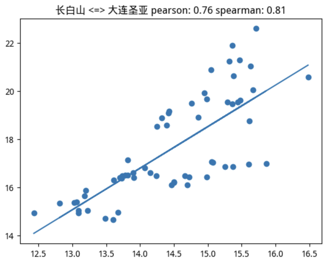
Luckily, the target we're looking for is among them.
You're probably wondering how the other three did. Did they post consecutive limit-ups? Did any of them crash?
None declined. Remember, we picked them by correlation — as long as that link holds, even if they don't follow the rally, they shouldn't sell off hard, right?
In fact, over the window in question, one was flat, one gained 5%, and another gained up to 16.9%. But if you want more upside, in this case a little tape-reading experience helps filter out two of them, leaving the 16.9% gainer and the six-bagger limit-up stock.
The tape-reading rule is simple: don't buy stocks with moving averages overhead, especially medium- to long-term ones. They'll face heavy selling pressure on the way up. If a small sector already has one or two names under attack, there's no spare capital left for these laggards.
This strategy also gives a clean sell signal. If the leader keeps rising but a stock's correlation drops below 0.75, that's clearly a cue to consider exiting. If the leader stalls — failing to lock limit-up within the first half hour after the open — that's also time to leave.
Here we've covered correlation within the same sector. Two sectors up- and downstream from each other can also be correlated, but with a lag. That's called cross correlation. How to compute it and how to use it — perhaps we'll explore that next.