
Alphalens Factor Analysis (2): Low Turnover Returns
In the previous note, we prepared the data for factor analysis. In this note, we'll run the actual factor analysis. In Alphalens the process is very simple — the key is knowing how to read its report.
The Alphalens Framework
Alphalens has four main modules: utils, tears, performance, and plotting.
The utils module handles data preprocessing. We already used get_clean_factor_and_forward_returns in the previous note — it is actually built from three methods: quantize_factor, get_clean_factor and compute_forward_return.
When this method runs, it prints a message like this:
Dropped 4.1% entries from factor data: 4.1% in forward returns computation and 0.0% in binning phase (set max_loss=0 to see potentially suppressed Exceptions).
max_loss is 35.0%, not exceeded: OK!This touches on several steps of the factor analysis pipeline, which we explain in detail in our course. For this quick start, we'll skip those details. Just remember: if you see not exceeded: OK! at the end, you're good to go.
Why Do You Need to Understand How Factor Analysis Works?
In this simple example (and the factor still works), the pipeline runs smoothly. But once you start building more complex factors, you'll run into problems. The most common one is getting stuck right here — after balancing the grouping and handling missing values, you are left with too few valid records.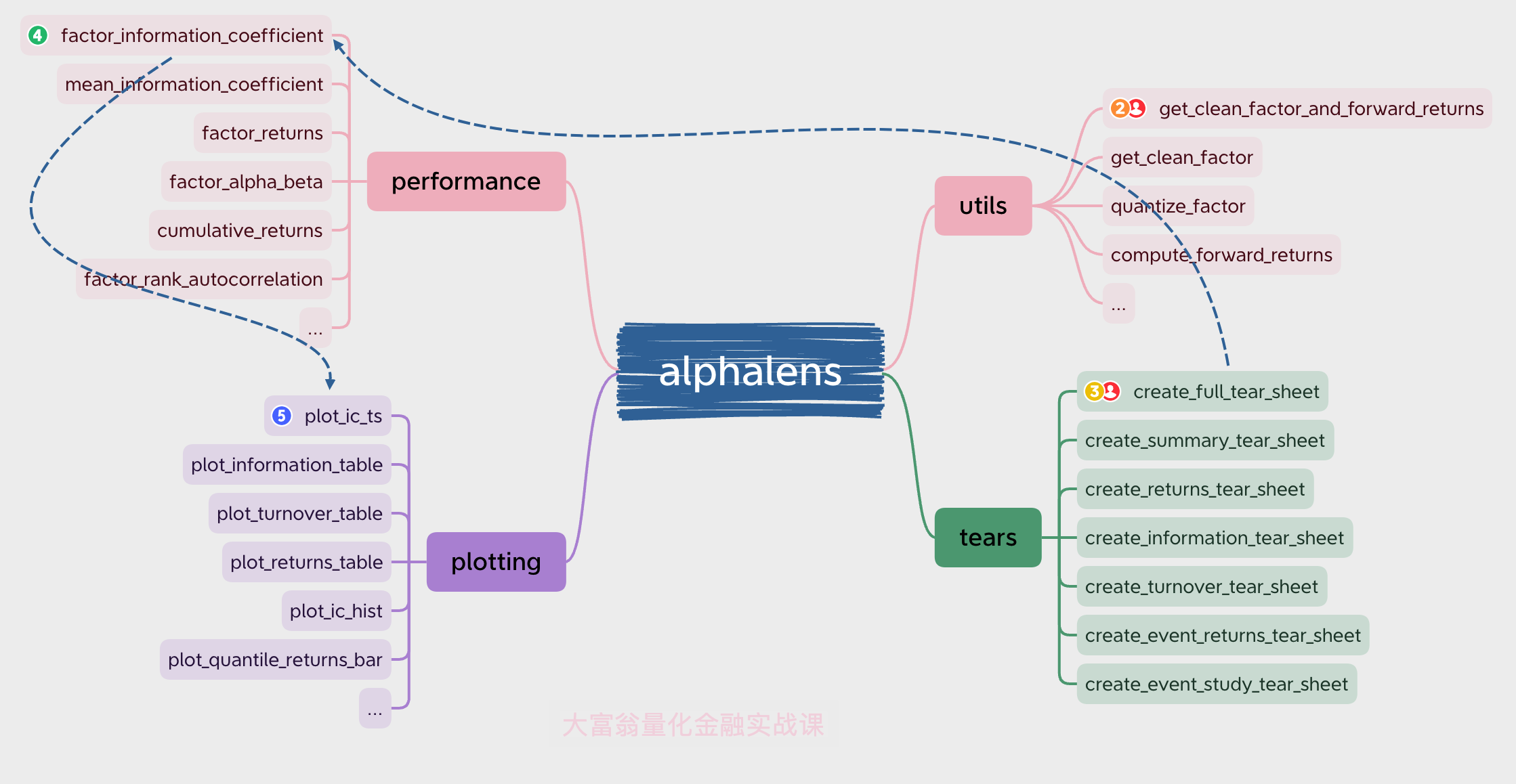
The performance module provides the core factor analysis calculations, while the plotting module handles charting. The tears module combines operations from performance and plotting to generate reports for the user.
utils and tears are the user-facing interfaces — you can work with just these two without worrying about how performance and plotting work under the hood.
Now let's look at factor_data (see the previous note for how this dataset was built):
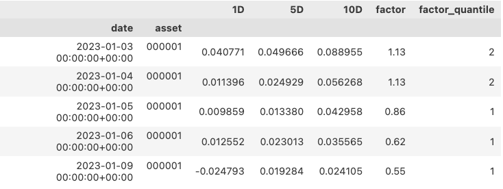
Columns like "1D" show the N-day forward return after the timestamp in that row. factor is the factor value at the time, and factor_quantile is its quantile bucket for that day. For example, the first row says that for ticker 000001 on Jan 3, the factor value was 1.13, placing it in bucket 2 (ranked from low to high, starting at 1). Over the next 1, 5, and 10 days, the asset gained 4%, 4.9%, and 8.8%, respectively.
Open or Close?
In this example we use close prices. **The correct approach** is generally to pass open prices to the prices table — Alphalens will then use the T+1 price as the entry price for a T-day factor signal, and the T+N+1 price as the exit price. If N is 1, the 1-day return for the T-period factor is $$ Ret=\frac{P_{t2}}{P_{t1}}-1 $$ Also, as a rule, T-period prices should never feed into T-period factor construction — that introduces **look-ahead bias**. Getting these details right is key to doing quantitative trading well.Return Analysis
The first thing we usually care about is factor returns. Return analysis isn't the most robust,
from alphalens.performance import mean_return_by_quantile
mean_return_by_q_daily, std_err = mean_return_by_quantile(
factor_data, by_date=True)
mean_return_by_q_daily.head()Here's what we get:
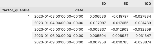
The output above only shows the first few periods for quantile 1. This level of detail is too granular for an overview — we'd rather see a summary. You can get that by setting by_date=False:
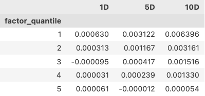
Quantile 1 — the bottom turnover group — earns 0.063% per day. Compounded over 250 trading days, that's a 17.05% annualized return. With this single factor alone, you've already beaten more than 98% of mutual-fund (no typo for 'cemetery') managers!
info
To reproduce these results here, make sure you use `quantiles=10` for grouping, not `bins=10`.import seaborn as sns
from alphalens.plotting import plot_quantile_returns_bar
plot_quantile_returns_bar(mean_return_by_q_daily)
sns.despine()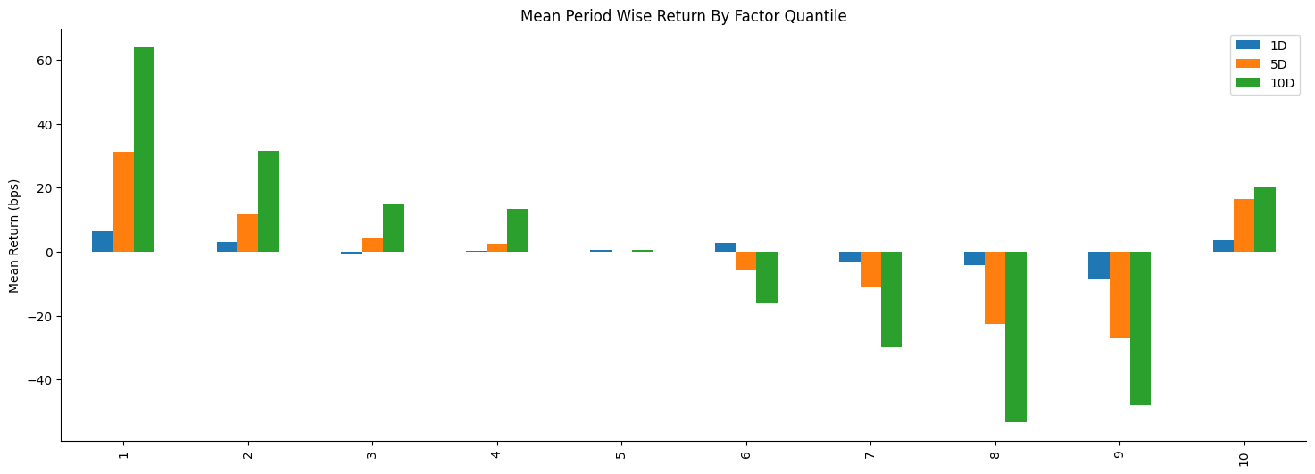
Here we use seaborn's despine() to remove the top and right spines.
The chart looks promising. It shows good monotonicity — performance deteriorates as the quantile number increases. Note that our signal is a turnover factor, so the lowest buckets are exactly the low-turnover stocks! With clean monotonicity like this, you can profit not only from the long position, but potentially double your gains by shorting the other side!
Still, average daily return alone isn't enough to judge a factor. We need to check the distribution — are those gains driven by just a few lucky bets? That's where the violin plot comes in:
from alphalens.plotting import plot_quantile_returns_violin
plot_quantile_returns_violin(mean_return_by_q_daily)
sns.despine()note
Note that when generating `mean_return_by_q_daily`, `by_date` must be `True`. Otherwise you only get scalars with no distribution to analyze.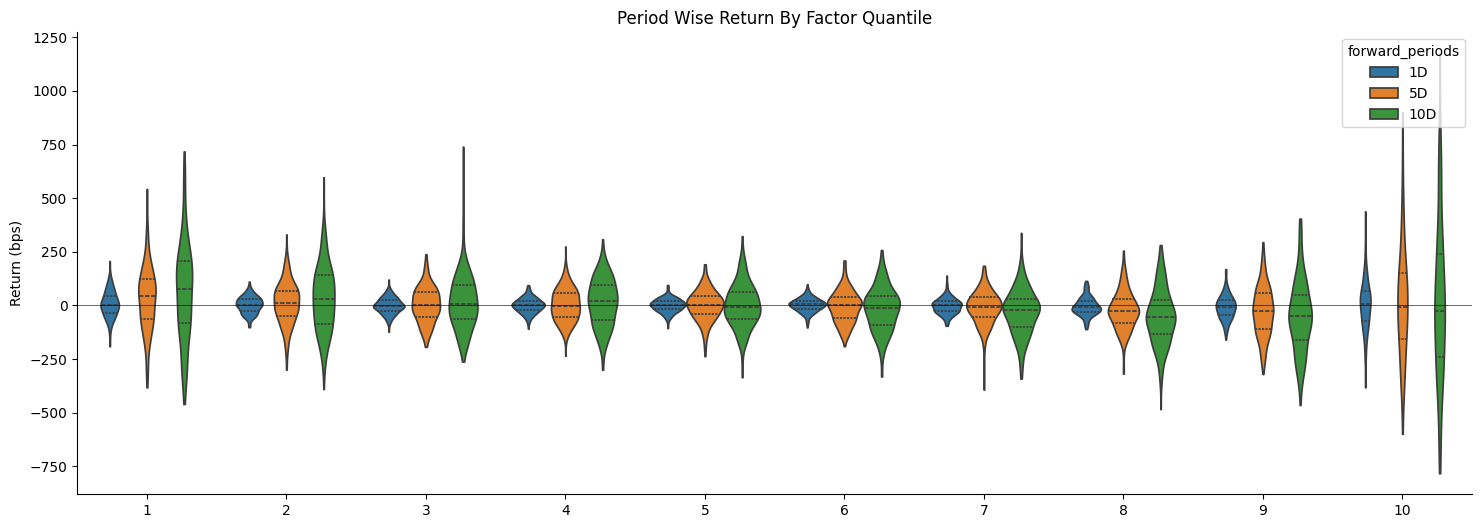
Let's focus on quantile 1. You can see (the chart is a bit small — try it on your own data!) that it's roughly normal with no long spikes, which suggests the positive returns aren't driven by a handful of outliers. Contrast that with the 10-day return for quantile 3, which shows a long spike — a likely outlier.
We can also look at the spread between the highest and lowest factor quantiles.
from alphalens.performance import compute_mean_returns_spread
from alphalens.plotting import plot_mean_quantile_returns_spread_time_series
qrs, ses = compute_mean_returns_spread(mean_return_by_q_daily,upper_quant=1, lower_quant=9,std_err=std_err)
plot_mean_quantile_returns_spread_time_series(qrs, ses)This gives us the chart below (1-day horizon only):
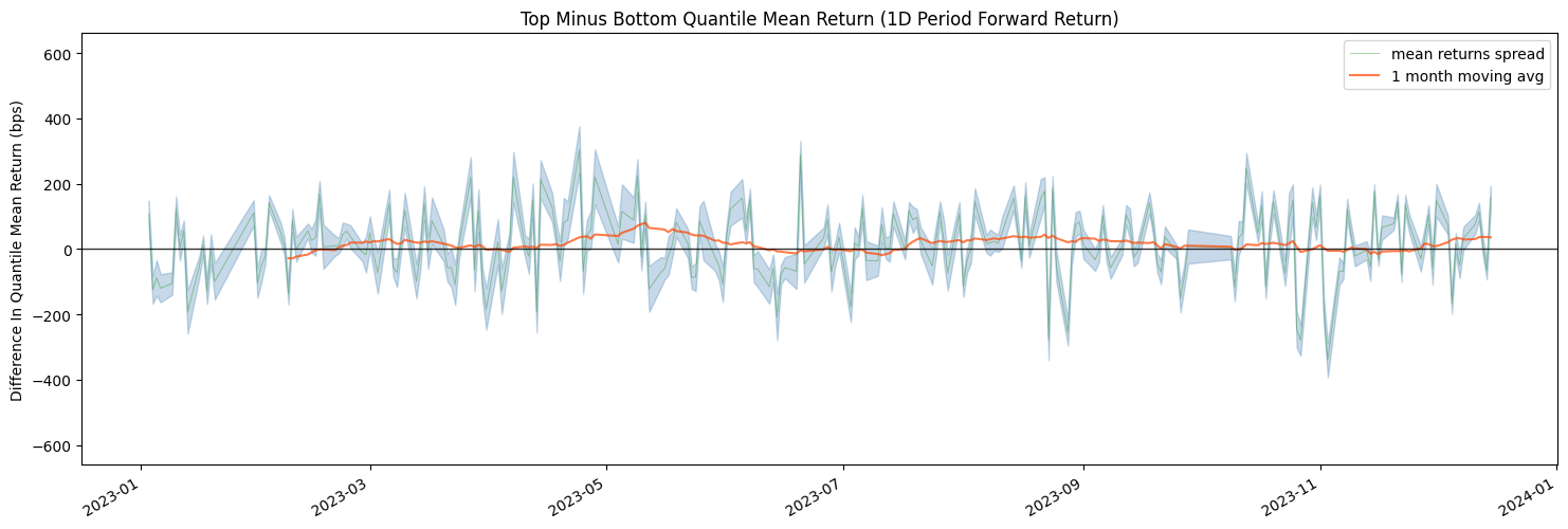
The red line is the monthly average. Most of the time it sits clearly and consistently above zero, suggesting a long-short strategy based on low turnover can deliver solid returns.
Important Note
When computing the long-short spread, `compute_mean_returns_spread` requires you to specify `upper_quant` and `lower_quant`. Here `upper_quant` is quantile 1, while `lower_quant` is quantile 9 — not 10, based on our earlier analysis.from alphalens.plotting import plot_cumulative_returns_by_quantile
mean_return_by_q_daily, std_err = mean_return_by_quantile(
factor_data, by_date=True)plot_cumulative_returns_by_quantile(mean_return_by_q_daily, period='1D')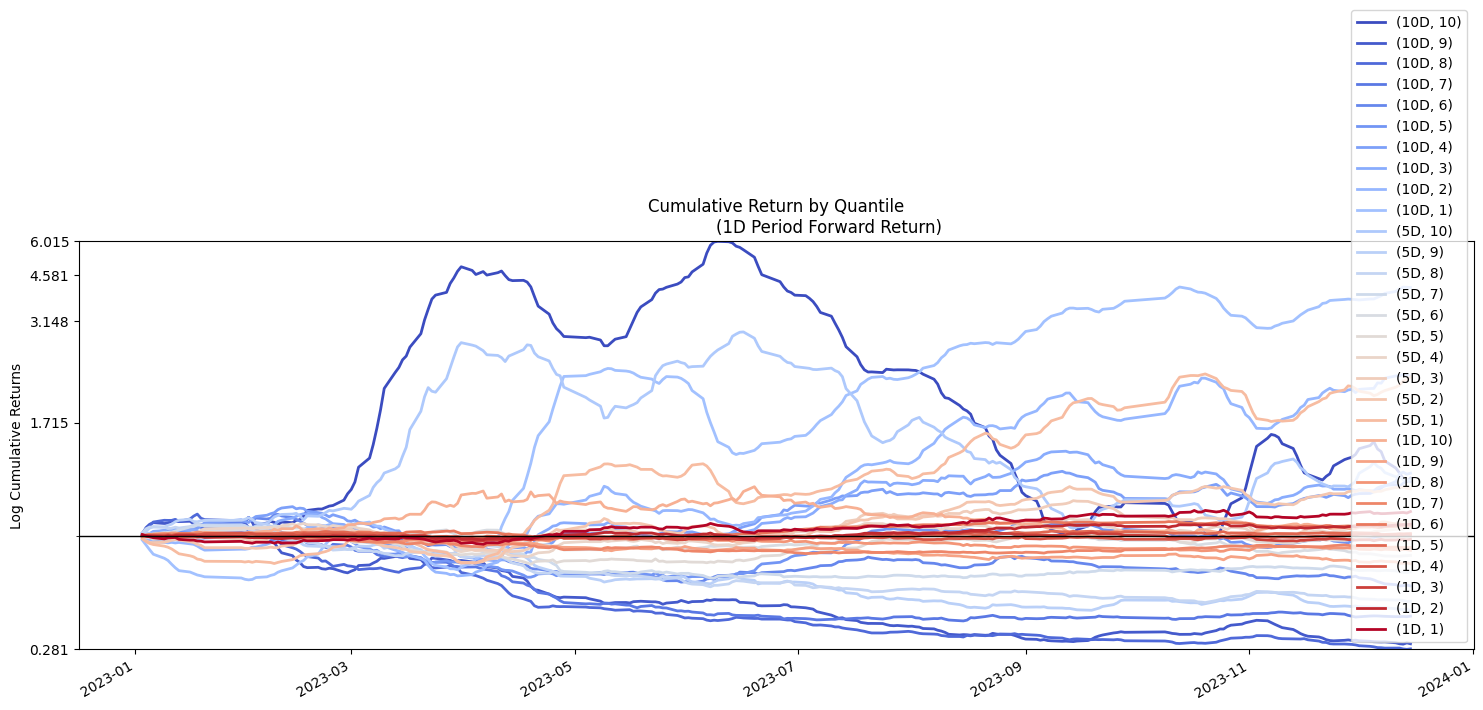
I think there's a bug in Alphalens here. We asked it to plot cumulative returns by quantile for the 1-day horizon only, but it also threw in the 5-day and 10-day lines, which only makes the chart harder to read — no thanks.
Judging from the cumulative return chart, combining this factor with the right timing signals could produce outsized gains. Even on its own, the best line (quantile 1) in the 1-day cumulative returns still shows a positive payoff.
What we've shown so far is returns by quantile bucket. Alphalens can also compute and plot returns for the factor as a whole. In this example that doesn't make much sense, because it's low turnover that creates value, not turnover itself.