
Don't Fly Solo: How Quants Use AI Tools
In investing circles, the storied friendship between Warren Buffett and Charlie Munger is a legend in its own right, beyond their wealth myth. Buffett once said of Munger: he expanded my horizons with the power of thought, taking me from ape to human at rocket speed.
How lucky in life to find such a kindred spirit. If you don't have that luck, in the AI era, at least we quants can have AI fly wingman for us.
In this post, I'll share a few short stories about how I use AI.
When teaching statistical inference, you almost have to introduce the Quantile-Quantile Plot as a visualization method. Humans are naturally gifted at spotting patterns visually, so this visualization is all but indispensable.
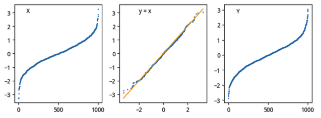
But while writing that chapter, I was still a bit fuzzy on the mechanics of the Q-Q plot: why do we sort the two random variables being compared before plotting? Why does a straight line mean the two variables are strongly related? Shouldn't we plot them in time order?
Using GPT-4 as a Three-Person Data Science Panel
There was no one to ask, even after searching the whole web. Later, even though repeated experiments and reasoning had convinced me I understood it, the fact that no one seemed to mention this point left me a little unsure. So I asked GPT-4.
My first few attempts didn't get me what I wanted. So I used a trick: I asked GPT-4 to imagine itself as a data scientist. And to guard against mistakes, I had three data scientists role-play — A and B would each present a view, then C would comment. This time I got an excellent result, as good as asking a human expert.
First, I gave GPT-4 the background:
quote
The principle of a Q-Q plot is: if X is an ordered dataset, then [X, X] plotted on a 2D plane must be a 45-degree straight line.If we have a random variable X and a hypothesized theoretical distribution Y, and if X follows that hypothesized distribution Y, then:
At the 50% quantile, sample $x_1$ from X should be very close to $y_1$ at the 50% quantile of Y (since they are random, they can hardly be exactly equal); at the 25% quantile, the 75% quantile, or more generally at any quantile, the samples from both should be very close.
In practice, we assume X is normally distributed with n observations. We first apply a z-score transform to X, then draw n random samples from the standard normal, call it Y, sort both arrays, and plot [X, Y]. If the result is close to a straight line, then X is normally distributed.
But the Q-Q plot transforms this: it directly takes $X_i$ and $Y_i$ at each index $I_i$ as the coordinates of a curve, so only one curve is drawn. If the two share the same distribution, that curve will be a straight line. At the time I didn't fully understand the properties of this transformation.
I had four questions in total:
question
1. Are there any factual errors in this description? 2. If we don't z-score X, would [X,Y] still be a straight line? 3. How does the value of n affect the plot? 4. Assuming X is indeed normally distributed, how is the one-to-one correspondence guaranteed between X and Y sampled from the standard normal?Data scientist A, played by GPT-4, spotted an error in the first paragraph of the background. The condition for $[X,X]$ to be a 45-degree line doesn't require $X$ to be ordered. For any dataset, the plot of $[X,X]$ will be a 45-degree line (obviously). For the second question, A answered:
quote
If we don't standardize X (i.e., perform a z-score transformation), the Q-Q plot may not form a 45-degree line. The reason we standardize is to put X and Y on the same scale, which makes it easier to compare them.For the third question, data scientist A argued:
quote
The number of data points (n) can affect the Q-Q plot in terms of its granularity. The more points we have, the smoother and more precise the plot will be. However, even with a small n, if the data follows the theoretical distribution, the points should still fall roughly along the line of equality.quote
Y, sampled from a standard normal distribution, does not necessarily correspond one-to-one with X in terms of specific data points. Instead, it corresponds to X in terms of the order of data points. When we sort X and Y, the smallest value of X is paired with the smallest value of Y, the second smallest with the second smallest, and so on.B and C mainly questioned and compared A's conclusions, which I'll skip here.
Neither A, B, nor C gave the final explanation: why $X_i$ and $Y_i$ at the same rank i should be close if random variables X and Y follow the same distribution. But they did confirm that our instinct to sort the variables before drawing a Q-Q plot was correct.
info
On this point, you should think in terms of CDF/PPF. If $X$ and $Y$ share the same distribution, then at any quantile $i$, the values (computed via ppf, the inverse of cdf) should be very close. And a sorted array's index naturally carries quantile meaning. Since $X$ and $Y$ should be close at any index $i$, the point $X_i, Y_i$ should fall on the line $y=x$. This transformation exploits the fact that the human eye is far more sensitive to straight lines, turning a hard-to-judge similarity between two curves into a test of whether a single curve is straight.In fact, this concept is explained quite clearly on the English Wikipedia. At the time I had only read the Chinese version.
import matplotlib.pyplot as plt
r1 = hchj["close"][1:]/hchj["close"][:-1] - 1
r2 = xrhj["close"][1:]/xrhj["close"][:-1] - 1
plt.scatter(sorted(r1), sorted(r2))
x = np.linspace(np.min(r1), np.max(r1), 40)
plt.plot(x,x, '-', color='grey', markersize=1)
plt.text(np.max(r1), np.max(r1), "x=x")We get the following quantile plot:
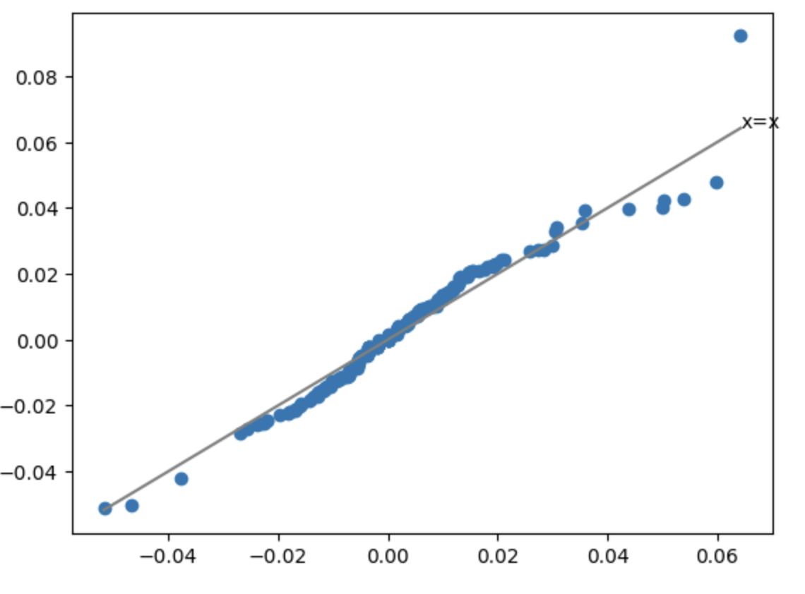
This shows very intuitively that the two stocks are indeed related: in the region below +4%, if A falls, B falls too, by about the same magnitude; if A rises, B rises too, again by about the same. That is exactly what correlation means. Here we stripped out time and compared only the two random variables — daily returns.
tip
Look closely at the part above +4%. It means when one name jumps more than 4%, the other fails to keep up. There may be a hidden opportunity here. Do you know how to analyze it?Learning to Code with Copilot
There are two Copilots. One is Copilot, the other, now called GitHub Copilot, is a VS Code extension. The latter launched in mid-2022 with a six-month free trial. It was an instant hit during the trial and quickly switched to paid. That directly drove Kite, a rival in the same space, out of business that November.
GitHub Copilot now costs $10/month. It's worth it, but for someone who doesn't code every day, a pay-per-token plan would be ideal.
There are two ways to get it free. One is free for students — if you have an edu email, apply on GitHub soon. The other is if your open-source project has over 1,000 stars, you may qualify for a free plan.
I generally use Copilot as a coding supplement. It's more meticulous than me at error handling, and it's great at auto-completing test data when writing unit tests (which every quant should insist on doing).
But I never expected it to one day teach me to program, introducing me to a Python library I'd never heard of.
It all started with ETF option expiry days. In recent years there seems to be a pattern: whenever expiry day arrives, China A-shares swing violently, mostly to the downside. So quant systems need to feed these expiry dates into the trading logic as a factor.
But pinning down those dates turned out to be surprisingly hard. The rules are:
Stock index futures expire on the third Friday of each month; ETF options expire on the Wednesday of the fourth week; A50 expires on the second-to-last trading day of the relevant month.
April 19 just passed as an index futures expiry. Next up is April 24, an ETF expiry. This year's expiry calendar looks like this:

I dashed off a few lines of code and found these dates are quite tricky to compute. So I opened Copilot Chat and asked:
quote
Stock index futures expire on the third Friday of each month; ETF options expire on the Wednesday of the fourth week; A50 expires on the second-to-last trading day of the relevant month.Based on this, write a method to find all expiry dates from 2018 through December 31, 2024.
import calendar
calendar.monthcalendar(2024, 4)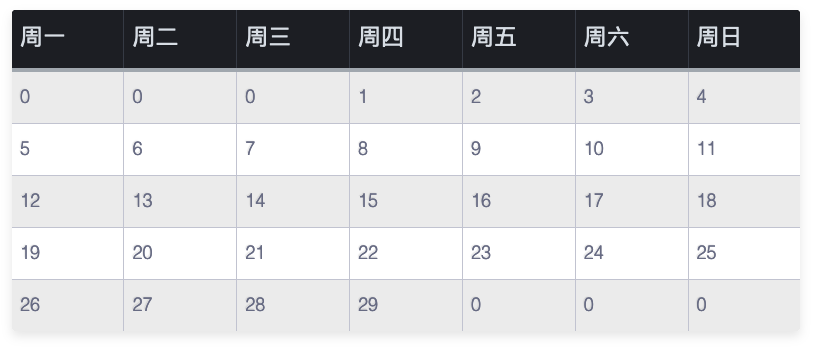
From there it was easy to adapt. Another fun example was asking Copilot to name a function for me.
I like to use this factor: the ratio of the median gain to the median loss over the last 20 days. Obviously, the larger the ratio, the stronger the bulls.
At first I used caculate_ratio as the function name. But almost any factor calculation could use that name. So I asked Copilot for a more precise name. Copilot replied that based on what it does, we could rename calculate_ratio to calculate_downward_exceeding_upward_median_ratio. That name describes the function more accurately: the proportion by which downside magnitude exceeds the upside median.
That name was too long, though, and inelegant. So I asked Copilot, can you make it shorter? Can you use a metaphor? Copilot replied:
quote
Of course. We can use "bear_bull_ratio" as the function name. This name is shorter and uses the market terms "bear" and "bull" for down and up markets, which conveys the meaning much better.